
Split from Summer offline in The Netherlands - 9 July 2010 by DRT.
A number of posts by jdaw1 and DRT did not survive the incompetent Administration of this topic. Oops.
What I really want is that which should be called VintagePortStencil. We see it sometimes on bottles: please send me examples. Or maybe DRT should separate the Stencil font ranting into a separate thread, to which pictures could be posted.
Meanwhile, the nicely-named TPF U13 is just too modern, though the same can be said of CargoCrate. Both Stencil and Army have too much ornament: top of the ‘7’ in particular really doesn’t work.
Stencil Fonts

Re: Summer offline in The Netherlands - 9 July 2010
It could be our modern twist on a traditional theme?jdaw1 wrote:What I really want is that which should be called VintagePortStencil. We see it sometimes on bottles: please send me examples. Or maybe DRT should separate the Stencil font ranting into a separate thread, to which pictures could be posted.
Meanwhile, the nicely-named TPF U13 is just too modern.
Worth noting that the page linked to in my previous post is also appropriately coloured.
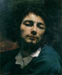
"The first duty of Port is to be red"
Ernest H. Cockburn
Ernest H. Cockburn
-
Chris Doty
- Graham’s Malvedos 1996
- Posts: 843
- Joined: 12:30 Fri 29 Jan 2010
Re: Stencil Fonts
FWIW, I don't care for #13. Looks like signs you'd see at a disued Italian army base (::someone says 'Italian army?' and everyone laughs heartily::)
Re: Stencil Fonts
Disagree. The logo of the Italian Army is indeed modern, but very oblique:

And signs seem to use type that is much more classical:

And signs seem to use type that is much more classical:
Re: Stencil Fonts
VintagePortStencil should perhaps resemble
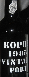
or either of
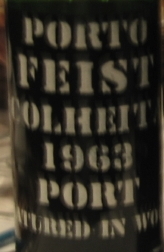
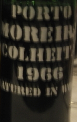
which, alas, are slightly out of focus.
Other examples please.
or either of
which, alas, are slightly out of focus.
Other examples please.
Re: Stencil Fonts
Note for type designers the characters needed are:
- ABCDEFGHIJKLMNOPQRSTUVWXYZ;
- abcdefghijklmnopqrstuvwxyz;
- 0123456789;
- áñçé (as in Cá (Cálem), Mñ (Quinta do Mañuela), Pç (Poças), Cç (Morgadio da Calçada), Ré (Réccua));
- + (as in Pt+);
- & (as in Silva & Cosens, Marks & Spencer);
- ? (as in unknown).
Re: Stencil Fonts
Request posted at typophile.com/node/71771.
-
JacobH
- Quinta do Vesuvio 1994
- Posts: 3300
- Joined: 16:37 Sat 03 May 2008
- Location: London, UK
- Contact:
Re: Stencil Fonts
If we can get some better pictures, I’m sure I could knock something together, especially the very limited character set for the Fonseca tasting. For the purposes of placemats, do we really need minuscules; I’ve never seen those on a stencilled bottle?

Re: Stencil Fonts
JacobH wrote:do we really need minuscules; I’ve never seen those on a stencilled bottle?
- MG = M. Gonzalez
Mg = Morgan - CC = Cockburn Quinta dos Canais
Cç = Morgadio da Calçada - Gb = Gilbert
GB = González Byass - Mn = Quinta Vale da Mina
Mñ = Quinta do Mañuela - Pc = Quinta da Peca
Pç = Poças - Ro = Rocha
RO = Royal Oporto - RR = Robertson Quinta do Roncão
Rr = Quinta de Roriz - Rv = Quinta da Revolta
RV = Robertson Rebello Valente - Vl = Quinta do Vallado
VL = Quinta de Valle Longo
-
uncle tom

- Dalva Golden White Colheita 1952
- Posts: 3520
- Joined: 23:43 Wed 20 Jun 2007
- Location: Near Saffron Walden, England
Re: Stencil Fonts
Have a look at the back of the current Bonhams catalogue, with its stencil of 'SOLERA 1842'
I'm afraid i've never climbed the learning curve to put photos on here, but this is a classic gentle stencil that is rather appealing..
Tom
I'm afraid i've never climbed the learning curve to put photos on here, but this is a classic gentle stencil that is rather appealing..
Tom
I may be drunk, Miss, but in the morning I shall be sober and you will still be ugly - W.S. Churchill
Re: Stencil Fonts

The cuts in the ‘A’ (meaning the non-cuts in the metal) are good and thick. Not sure the ‘L’ needed to be cut so thick, but there it is. Solid imposing paint-can-get-through-this throughout.
-
JacobH
- Quinta do Vesuvio 1994
- Posts: 3300
- Joined: 16:37 Sat 03 May 2008
- Location: London, UK
- Contact:
Re: Stencil Fonts
I’ve just wasted a couple of hours, though I fear much more (in addition to much more talent) is required. (Yes, most of the non-traced characters are completely rubbish and it all needs smoothing but I thought it might be fun to put it up now)...jdaw1 wrote:The cuts in the ‘A’ (meaning the non-cuts in the metal) are good and thick. Not sure the ‘L’ needed to be cut so thick, but there it is. Solid imposing paint-can-get-through-this throughout.
Re: Stencil Fonts
- The ‘0’ is insufficiently symmetrical;
- I don’t like the ‘1’;
- ‘2’ OK;
- the ‘3’ is a mess, as you say;
- ‘4’ OK, except for the top of the lower piece;
- the curve of the ‘5’ needs to go further round (clockwise);
- the ‘6’ less messier than the ‘3’ but still a mess;
- ‘7’ looks Arabic;
- ‘8’ insufficiently symmetrical;
- ‘9’ not shown.
-
JacobH
- Quinta do Vesuvio 1994
- Posts: 3300
- Joined: 16:37 Sat 03 May 2008
- Location: London, UK
- Contact:
Re: Stencil Fonts
Yes, indeed, and more-so. At some stage I’ll redo the lot. These sorts of exercises always remind me why I much prefer using type than designing it...It’s quite an interesting style though; the letters have obviously been drawn onto the template with a brush and then cut out which gives a combination of fluidity and rigidity.jdaw1 wrote:
- The ‘0’ is insufficiently symmetrical;
- I don’t like the ‘1’;
- ‘2’ OK;
- the ‘3’ is a mess, as you say;
- ‘4’ OK, except for the top of the lower piece;
- the curve of the ‘5’ needs to go further round (clockwise);
- the ‘6’ less messier than the ‘3’ but still a mess;
- ‘7’ looks Arabic;
- ‘8’ insufficiently symmetrical;
- ‘9’ not shown.
(Though I would note that the 8 is strikingly asymmetrical; I think a symptom of being drawn with 4 separate brush strokes).
-
JacobH
- Quinta do Vesuvio 1994
- Posts: 3300
- Joined: 16:37 Sat 03 May 2008
- Location: London, UK
- Contact:
Re: Stencil Fonts
I think I might be getting a bit closer to the eventual goal, though there's still much work to do. I haven't looked at spacing yet which is why some letters look too close or far apart.
Re: Stencil Fonts
JacobH: you have emails. And need to tackle A→Z and a→z and áñçé+&?.
-
JacobH
- Quinta do Vesuvio 1994
- Posts: 3300
- Joined: 16:37 Sat 03 May 2008
- Location: London, UK
- Contact:
Re: Stencil Fonts
I've made some progress on the Solera 1842 typeface. A new sample is now online and below. Any thoughts would be welcome. I've so far only worked on the characters: ACEHILORST and 0123456789.
- example.png (16.57 KiB) Viewed 6914 times