Port and Typography

Anything to do with Port.
Post Reply
User avatar
JacobH
Quinta do Vesuvio 1994
Posts: 3300
Joined: 16:37 Sat 03 May 2008
Location: London, UK
Contact:

Port and Typography

Post by JacobH »

Right, I should warn you that below lies quite a lot of geekiness. If this is likely to offend you, then look away now! :D

An interest of mine is in typography, which is mostly the design of typefaces (or fonts) and their use in print. I therefore find it quite interesting to have a look at the typefaces and typography of Port labels whenever I open a bottle. Whereas many wines, particularly in the New World, go in for quite complex bottle and label designs, with Port only two things really matter: the name of the shipper and the year, which really brings into pre-eminence the setting of the shipper’s name. Apart, of course, for Sandeman, Port labels are therefore quite text-heavy, which makes the choice of typeface extremely important.

At one end of the spectrum seems to be the Symington brands. They seem to have gone for very solid, very English choices, but with minimum customisation. As far as I can tell, they use Baskerville (Dow), Carlson (Warre) and Gill Sans (Grahams and Gould Campbell) which are perhaps three of the most significant faces to be designed in the UK. Smith Woodhouse looks to me like Copperplate Gothic which is American (Goudy) whilst, interestingly, Quinta do Vesuvio looks like a Modern—something one tends to associate more with Continental Europe than the UK.

At the other end, we have the Taylor Fladgate Partnership, who appear to have gone for custom faces for all their logos. Taylor’s itself looks like it had some Copperplate Gothic, but is much more flamboyant, particularly in the Y and the R. I think it works, but only just. The worst two logos are Croft, with the diamonds for the beam of the F and in the middle of the O (it really should be on the front of a Hornblower novel) and the TPF logo itself, which I think might have been made out of Papyrus (c.f. “5 Terrible Fonts You Should Never Use in Print†.

Of course there are other approaches. Niepoort’s hand-written logo looks very cool and others (particularly Sandeman) seem to have gone for quite unusual (possibly even custom) typefaces without drawing attention to its use.

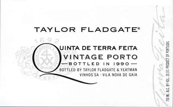
So, do I have any conclusions? Certainly, TFP gets my vote as having the best text-based Port label with its new SQVP ones:
Image
That is typography at it’s best: understated and simple yet immediately memorable. Equally, perhaps they could have achieved the same result with a little less effort and money by adopting the Symington’s approach and wouldn’t have commissioned such poor work as the TFP logo.

Just some thoughts… What choice of typefaces do you particularly admire on Port?
User avatar
benread
Niepoort 1977
Posts: 1555
Joined: 21:36 Thu 17 Apr 2008
Location: Reigate, Surrey
Contact:

Post by benread »

I personally look at the bottle shape first. I am very traditional - I like my wine bottles to look like wine bottles, not the output from some 1st year art student!

Once that has been established, I am in the "KISS" category - Keep It Simple Stupid! Therefore I think I agree with you - I liked the picture above.
Ben
-------
Vintage 1970 and now proud owner of my first ever 'half-century'!
Conky
Fonseca 1980
Posts: 1770
Joined: 23:51 Wed 20 Jun 2007

Post by Conky »

I love the painted stencil look. But I dont think thats a Font.
User avatar
JacobH
Quinta do Vesuvio 1994
Posts: 3300
Joined: 16:37 Sat 03 May 2008
Location: London, UK
Contact:

Post by JacobH »

Conky wrote:I love the painted stencil look. But I dont think thats a Font.
That’s quite an interesting question. The Madeira shippers who still do it for all their bottles must be using some sort of electronically cut templates which I think would work for from some pre-designed fonts. For the older bottles, though, which would be done with hand-cut templates, they were probably cutting them by hand.
User avatar
jdaw1
Cockburn 1851
Posts: 23632
Joined: 15:03 Thu 21 Jun 2007
Location: London
Contact:

Re: Port and Typography

Post by jdaw1 »

Arial is much maligned, quite possibly by the Mac (Helvetica) crowd who hate anything PC (which comes with Arial).

Yes, the Arial “t† is awful. But the Arial “a† is better than that of Helvetica Regular (the unwise tail being dropped on some non-regular weights). And Helvetica’s “G† is overly complicated. Arial’s fractions (“½†) also seem better sized for modern typography than those of Helvetica.

But, to repeat, Arial’s “t† is the work of Satan.
User avatar
JacobH
Quinta do Vesuvio 1994
Posts: 3300
Joined: 16:37 Sat 03 May 2008
Location: London, UK
Contact:

Post by JacobH »

That’s a fair point. Arial (and impact) certainly aren’t in the same league as the others for inappropriateness in print. I have to say, though, that I just find Arial and Helvetica quite dull as choices for anything, when there are lots of more interesting sans-serifs out there.
User avatar
Alex Bridgeman
Graham’s 1948
Posts: 14912
Joined: 13:41 Mon 25 Jun 2007
Location: Berkshire, UK

Re: Port and Typography

Post by Alex Bridgeman »

A very interesting thread and one I enjoyed reading. I've never really given much thought to the typography of a label, just instinctively felt which I liked and which I didn't.

My personal favourite from the modern labels is the Vesuvio; elegant, simple and understated.

My all time favourite would be the Fonseca labels from the '50s and '60s. I just love the black 9 x 13cm label with "FONSECA 1963" written on in large, clear letters. The other stuff is also on the label, but much more discretely than the name of the shipper and the year of the harvest.

and finally, I assume this was an extremely amusing typing error
JacobH wrote:...and the TPF logo itself...
Alex

PS - does this mean that you want pictures of the labels of all the bottles that we open in the future?
Top Ports in 2023: Taylor 1896 Colheita, b. 2021. A perfect Port.

2024: Niepoort 1900 Colheita, b.1971. A near perfect Port.
User avatar
DRT
Fonseca 1966
Posts: 15779
Joined: 23:51 Wed 20 Jun 2007
Location: Chesterfield, UK
Contact:

Post by DRT »

I created this last night following a request from AHB. Each of the fonts used is slightly different to the original due to limitations of my PC. I can never understand this kind of label - why would anyone choose to use so many typeface families on one piece of artwork? It makes my head hurt.

Image

Derek
"The first duty of Port is to be red"
Ernest H. Cockburn
Roy Hersh
Niepoort LBV
Posts: 283
Joined: 21:55 Mon 31 Dec 2007

Post by Roy Hersh »

That’s quite an interesting question. The Madeira shippers who still do it for all their bottles must be using some sort of electronically cut templates which I think would work for from some pre-designed fonts. For the older bottles, though, which would be done with hand-cut templates, they were probably cutting them by hand.
Not the case Jacob. The vast majority still do this by hand. Even the major players on the island still use hand cut stencils. I've seen it done in person a couple of times now. There is a picture of this on my homepage with a handcut gold-plate stencil at Barbeito.

The only one that I know for sure that uses machine cuts is Justino.
User avatar
RonnieRoots
Fonseca 1980
Posts: 1981
Joined: 08:28 Thu 21 Jun 2007
Location: Middle Earth

Post by RonnieRoots »

I also liked the labels that TFP used for the single quintas a lot. Since the big makeover somewhere around 2003 / 2004 the lay out of these bottles is utter crap though.

Image

(Picture is nicked from port-blog.com and made by Axel P.)
User avatar
uncle tom
Dalva Golden White Colheita 1952
Posts: 3520
Joined: 23:43 Wed 20 Jun 2007
Location: Near Saffron Walden, England

Post by uncle tom »

Interesting thread.

Jacob, is it relatively easy, using a photo of an old label, to generate a new computer font that is a near perfect match?

Obviously the character set would be limited to those available, but it would be nice to have a sympathetic font when making facsimile labels for old bottles that have either lost them, or never had them in the first place.

I'm not suggesting that an attempt should be made to fully replicate all the fonts and formatting on each label, as that would infringe copyright - just a set of fonts called Cockburn, Taylor, Sandeman etc - with only enough characters to make up the name of the shipper.

Is that feasible?

Tom
I may be drunk, Miss, but in the morning I shall be sober and you will still be ugly - W.S. Churchill
User avatar
DRT
Fonseca 1966
Posts: 15779
Joined: 23:51 Wed 20 Jun 2007
Location: Chesterfield, UK
Contact:

Post by DRT »

Tom,

I have a template for Cockburn labels that look like this:
Image

Let me know if you need any.

Derek
"The first duty of Port is to be red"
Ernest H. Cockburn
User avatar
jdaw1
Cockburn 1851
Posts: 23632
Joined: 15:03 Thu 21 Jun 2007
Location: London
Contact:

Was it always Cockburn Smithes?

Post by jdaw1 »

Careful. Company names change with time. Was it always Cockburn Smithes?
User avatar
DRT
Fonseca 1966
Posts: 15779
Joined: 23:51 Wed 20 Jun 2007
Location: Chesterfield, UK
Contact:

Re: Was it always Cockburn Smithes?

Post by DRT »

jdaw1 wrote:Careful. Company names change with time. Was it always Cockburn Smithes?
The wording was specified by the customer. I didn't question it. Perhaps he should check?

Derek
"The first duty of Port is to be red"
Ernest H. Cockburn
User avatar
uncle tom
Dalva Golden White Colheita 1952
Posts: 3520
Joined: 23:43 Wed 20 Jun 2007
Location: Near Saffron Walden, England

Post by uncle tom »

The overall format and detail is a minefield; just stick to the shipper's headline name.

I've just checked Derek's font for the name 'Cockburn' against a '67 and a '94. The fonts used for these two are not absolutely identical, but very close.

Derek's font has a very variable line thickness, while the actual Cockburn font is much more uniform. The serifs on the Cockburn font are also heavy and square ended, not fine and tapered as used above.

Trying to find a perfect matching font from the thousands in circulation sounds much more laborious than creating a new one from an existing label.

Tom
I may be drunk, Miss, but in the morning I shall be sober and you will still be ugly - W.S. Churchill
User avatar
jdaw1
Cockburn 1851
Posts: 23632
Joined: 15:03 Thu 21 Jun 2007
Location: London
Contact:

identifont.com

Post by jdaw1 »

uncle tom wrote:Trying to find a perfect matching font from the thousands in circulation sounds much more laborious than creating a new one from an existing label.
Wrong. New fonts are exceedingly fiddly to create. And identifont.com, WhatTheFont and fontexpert.com can do a lot of the work. I tend to use identifont.com: don’t believe its best choice, instead compare your sample to its best ten and you’ll get something very close to a match.
User avatar
uncle tom
Dalva Golden White Colheita 1952
Posts: 3520
Joined: 23:43 Wed 20 Jun 2007
Location: Near Saffron Walden, England

Post by uncle tom »

Julian,

I know that computer fonts exist as complex mathematical formulae, and that if you want to conjure one up from scratch you have to be a pretty fit number cruncher.

But I can't help feeling that given an existing image, there must be a bit of software somewhere that can take the image as a bitmap, clean it up, and then after reading it pixel by pixel, derive the formula necessary to recreate it as a TrueType font.

Don't they do something similar with computer animations?

Tom
I may be drunk, Miss, but in the morning I shall be sober and you will still be ugly - W.S. Churchill
User avatar
jdaw1
Cockburn 1851
Posts: 23632
Joined: 15:03 Thu 21 Jun 2007
Location: London
Contact:

More on fonts

Post by jdaw1 »

uncle tom wrote:But I can't help feeling that given an existing image, there must be a bit of software somewhere that can take the image as a bitmap, clean it up, and then after reading it pixel by pixel, derive the formula necessary to recreate it as a TrueType font.
You don’t want a font. You want a smooth scalable print-at-any-size image. That can be done from a bitmap.

But finding the font is probably easier.
User avatar
JacobH
Quinta do Vesuvio 1994
Posts: 3300
Joined: 16:37 Sat 03 May 2008
Location: London, UK
Contact:

Post by JacobH »

Not the case Jacob. The vast majority still do this by hand. Even the major players on the island still use hand cut stencils. I've seen it done in person a couple of times now. There is a picture of this on my homepage with a handcut gold-plate stencil at Barbeito.

The only one that I know for sure that uses machine cuts is Justino.
Ah, interesting, I stand corrected. I’d assumed that the numbers were so large for non-vintage bottles that they would need to have machined templates.

Tom, it is certainly possible to produce a font from scans of labels and the like. However, there are a few issues surrounding this.

In the first instance, quite a few shippers do use standard off-the-shelf typefaces for their logos. Despite the impression those “1001 Fonts† CDs might give, there are actually very few commercial typefaces in existence and using tools such as the ones that Julian has linked to it’s quite easy to work out which ones have been used. Cockburn’s is quite a good example: the face is Clarendon Text SC (the give-away is the curly R). The only things that have been changed are the size of the first C and the positioning of the apostrophe:

Image

Although it is not necessary unlawful to re-vectorise a commercial typeface, there are some quite strong ethical issues against that and if anyone wants to produce replacement labels using those sorts of fonts, it’s probably worth getting a license (which is fairly cheap in any case). For “emergency use† it is possible to engage in the slightly dubious practice of going to a commercial font retailer (e.g. MyFonts) and using their “font preview† facility to get the required image. That would allow you to get the name and the year of any shipper (like the Symington ones) who haven’t customised their fonts.

Now, for Taylor’s and others who have custom fonts as their logos, it would be possible to vectorise them and turn them into usable fonts. However, I’m not sure whether that would be necessary if all you want is an ability to replace labels. Instead, it would be much easier to vectorise the logos and keep them as a simple vector image (i.e. an SVG) which could then be used at any size. It would only really be necessary to turn the logos into fonts if you were planning on using them in running text.

In any case to get exact replacements of the running text on the labels, it will probably be necessary to buy licenses for the most commonly used fonts (e.g. Copperplate Gothic and Gill Sans for Taylor’s) as creating an entire font from scans is both morally dubious and very difficult to do (for example, all fonts have to be “kerned† so that when, say, an A and W are next together, the white-space of the two glyphs overlap).

Do you have any particular bottles in mind?
User avatar
Rubby
Fonseca LBV
Posts: 129
Joined: 13:33 Tue 28 Aug 2007
Location: Utrecht, The Netherlands

Post by Rubby »

Very interesting read.
I'm a Desk Top Publisher by trade and I sometimes have to spend a day trying to find the precise typefont a certain text is composed in.
Here's a nifty little helper if you're trying to find what typefont is used in a label (if you have a scanner, or grab a picture from the www):
http://www.myfonts.com/WhatTheFont/
Ofcourse the chances of finding the exact typeface are slim, but it gives you a good pointer in the right direction.

Thanks to my profession I've got quite a large typeface collection (several hundreds, I think), but sometimes I still can't find the right one. That might be because some of the larger companies have their own typeface created for them, or in the case of a company logo, take an excisting typeface and give it a little 'twist' to create an original look.
Frequently Ask Questions
User avatar
JacobH
Quinta do Vesuvio 1994
Posts: 3300
Joined: 16:37 Sat 03 May 2008
Location: London, UK
Contact:

Re: Port and Typography

Post by JacobH »

After posting this thread, I’ve been slowly working to positively identifying the typefaces used by the major shippers. The eventual plan it to put together a web page with some examples of the real thing and reconstructions, which I hope might prove useful to anyone who wishes to relabel an old bottle (and also generally to be interesting). Interestingly, the most popular typeface seems to be Copperplate Gothic; a typeface you often see on business cards (and, as wikipedia puts it, acid-etched glass) but rarely on commercial products.

Stage 2 might be to look at the development of logos. At the moment, I have generally tried to look at what is currently being produced but some changes are still quite noticeable. For example, compare the Delaforce logo before (top) and after (bottom) its acquisition by TFP.
Delaforce Logos
Delaforce Logos
delaforce.png (18.51 KiB) Viewed 11335 times
For anyone who is interested, this is my current list (in an rough-and-ready state).

Code: Select all

Churchill. Copperplate Gothic, extra bold, uppercase.
Cockburn. Clarendon Text, bold, small caps.
Croft. Caslon, bold, uppercase, custom O and F.
Dow. Baskerville, extra bold or heavy, uppercase.
Feist. Stenciled.
Ferreira. Bondoni, bold, uppercase.
Fonseca. Unknown. Possible custom.
Gould Campbell. Gill Sans, regular, uppercase.
Graham. Gill Sans, bold, uppercase.
Kopke. Stenciled.
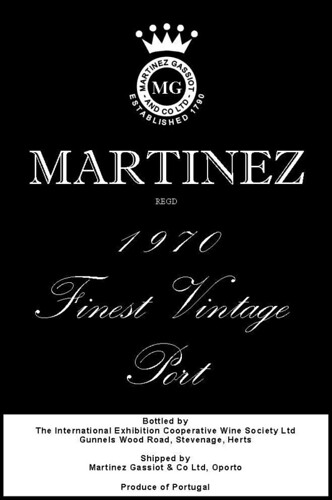
Martinez. ITC Giovanni, fake (?) small caps, custom elongated tail on R.
Messias. Stenciled.
Niepoort. Hand-lettering.
Offley. Unknown. Perhaps custom version of Copperplate Gothic.  
Quarles Harris. ITC Clearface, fake (?) small caps.
Quinta do Infantado. Hand-lettering.
Quinta do Noval. Stenciled.
Quinta do Vesuvio. Unknown. Perhaps Bondoni, bold (N.B. z-shaped tail on Q).
Ramos Pinto. Unknown
Royal Oporto. Unknown
Rozes. Stenciled.
Sandeman. News Gothic, bold, condensed, uppercase.
Smith Woodhouse. Copperplate Gothic, regular, uppercase.
Taylor. Copperplate Gothic, bold, uppercase, custom swashing on Y, L and R.
Warre. Unknown, usually engraved (sed quaere older bottles), uppercase.
-Jacob
Image
User avatar
uncle tom
Dalva Golden White Colheita 1952
Posts: 3520
Joined: 23:43 Wed 20 Jun 2007
Location: Near Saffron Walden, England

Re: Port and Typography

Post by uncle tom »

Very interesting research Jacob,

Would you like us to preserve some labels for you to analyse?

- I'm just about to bin a Warre '63 bottle with a good Oporto label, and my next victim will be a Gilbert '91..

You only give one font description for Graham, but there have been three distinct designs over the last 40 years; there was the old Graham family label, which goes back to WWII, and possibly before, the new design introduced by the Symingtons in the early 70's when they bought the company, and a more recent design, somewhat intermediate between the two, whose exact date of introduction I'm not sure about.

Tom

PS: if you want to have a nose round my cellar, armed with a camera, you're very welcome!
I may be drunk, Miss, but in the morning I shall be sober and you will still be ugly - W.S. Churchill
User avatar
jdaw1
Cockburn 1851
Posts: 23632
Joined: 15:03 Thu 21 Jun 2007
Location: London
Contact:

Re: Port and Typography

Post by jdaw1 »

Can you work from a picture of a bottle, uneven foreshortening and all? If yes, perhaps some of the following would help:
  1. 20080929_ferreira_1980.gif;
  2. 20080929_ferreira_1994.gif;
  3. 20080929_ferreira_colours.gif;
  4. 20080929_ferreira_lbv_2000.gif;
  5. 20080929_seixo_1983.gif;
  6. 20080929_ferreira_1975.gif;
  7. 20080928_estanho_20y.gif;
  8. 20080928_javali_lbv_2003.gif;
  9. 20080928_quevedo_2005.gif;
  10. 20080928_quevedo_lbv_2003.gif;
  11. 20081008_cockburn_1935a_bottle.gif;
  12. 20081008_cockburn_1935b_bottle.gif;
  13. 20081008_cockburn_1963_bottle.gif;
  14. 20081008_cockburn_1908_bottle.gif;
  15. 20081008_cockburn_1947_label.gif;
  16. 20081008_cockburn_1955_bottle.gif;
  17. 20081008_cockburn_1927_bottle.gif;
  18. 20081008_cockburn_1960_bottle.gif;
  19. 20081008_cockburn_1997_bottle.gif;
  20. 20081008_cockburn_1994_bottle.gif;
  21. 20081008_cockburn_1977_bottle.gif;
  22. 20081008_cockburn_1912_bottle.gif;
  23. 20081008_cockburn_2000_bottle.gif;
  24. 20081008_cockburn_1985_bottle.gif;
  25. 20081008_cockburn_1991_bottle.gif;
  26. 20081008_cockburn_1970_bottle.gif;
  27. 20081008_cockburn_1983_bottle.gif;
  28. 20081008_cockburn_1967_label.gif;
  29. 20081008_cockburn_1912_label.gif;
  30. 20080913_bottles.jpg;
  31. 20080913_g85_back.gif;
  32. 20080913_nn85_back.gif;
  33. 20080913_g85_front.gif;
  34. 20080913_nn85_front.gif;
  35. 20080830_1994_osbourne_bottle.png;
  36. 20080823_marco_label.png;
  37. 20080820_marco1983.png;
  38. 20080813_obv85_bottle.png;
  39. 20080811_back.png;
  40. 20080811_front.png;
  41. 20080811_port.png;
  42. 20080718_ev97_back.jpg;
  43. 20080718_ev97_front.jpg;
  44. 20080718_obv97_back.jpg;
  45. 20080718_obv97_front.jpg;
  46. 20080718_sv97_back.jpg;
  47. 20080718_sv97_front.jpg;
  48. 20080712_pw_new_label.jpg;
  49. 20080712_pw_description.jpg;
  50. 20080711_pr87_front.JPG;
  51. 20080711_pr87_side.JPG;
  52. 20080711_pr87_signature.JPG;
  53. 20080711_sk89_back.JPG;
  54. 20080711_sk89_front.JPG;
  55. 20880620_t63_bottle.jpg;
  56. 20080528_back.jpg;
  57. 20080528_front.jpg;
  58. 20080520_bottles.jpg;
  59. 20080517_mz97_back.jpg;
  60. 20080517_mz97_front.jpg;
  61. 20080505_1980_hutcheson_front.jpg;
  62. 20080505_1980_hutcheson_back.jpg;
  63. 20080511_1994_rainha_santa_front.jpg;
  64. 20080511_1994_rainha_santa_back.jpg;
  65. 20080514_1997_martinez_case.JPG;
  66. 20080508_bottles_right.jpg;
  67. 20080508_bottles_left.jpg;
  68. 20080331_1977niepoort_tasting.gif;
  69. 20080331_1977dow.gif;
  70. 20080331_1994taylor.gif;
  71. 20080331_1977niepoort.gif;
  72. 20080329_taylor1994.jpg;
  73. 20080329_bottles.jpg;
  74. 20080329_cachao_back.jpg;
  75. 20080329_cachao_label.jpg;
  76. 20080329_fonseca_bottle.jpg;
  77. 20080329_fonseca_label.jpg;
  78. 20080329_niepoort_badge.jpg;
  79. 20080329_niepoort_label.jpg;
  80. 20080329_niepoort_neck.jpg;
  81. 20080323_burmester77_recessed.jpg;
  82. 20080323_burmester77_label.jpg;
  83. 20080128_bottles.JPG;
  84. 20080202_dow_bottle.JPG;
  85. 20080202_noval_bottle.JPG;
  86. 20080202_offley_croft_bottles.JPG;
  87. 20080202_offley_price.JPG;
  88. 20080202_cockburn_delaforce_bottles.JPG;
  89. 20080202_cockburn_bottle.JPG;
  90. 20080202_noval_other.JPG;
  91. 20080112-back.jpg;
  92. 20080112-front.jpg;
  93. 20080103-bottles1.jpg;
  94. 20080103-bottles2.jpg;
  95. 20071227-bottles.jpg;
  96. 20071227-offley68.jpg;
  97. 20071226-bottles.jpg;
  98. 20071209_vesuvio.jpg;
  99. 20071201-croft63-bottle.jpg;
  100. 20071029-bottles.JPG;
  101. 20071029-decanters.JPG;
  102. 20070830-d77-front.JPG;
  103. 20070824_nn87_front.jpg;
  104. 20070824_nn87_vdp.jpg;
  105. 20070824_nn87_back.jpg;
  106. 20070817-w85-back.JPG;
  107. 20070815-w77-back.JPG;
  108. 20070812-w63-back.JPG;
  109. 20070812-w63-front.JPG;
  110. 20070812-w63-vdp.JPG;
  111. 20070815-w77-damp.JPG;
  112. 20070809-w60-label.JPG;
  113. 20070815-w77-front.JPG;
  114. 20070815-w77-vdp.JPG;
  115. 20070817-w85-front.JPG;
  116. 20070727_rp85.jpg;
  117. 20070714-cockburn-1963.jpg;
  118. 20070714-dow-1963.jpg;
  119. 20070714-fonseca-1966.jpg;
  120. 20070714-graham-1955.jpg;
  121. 20070714-warre-1977.jpg;
  122. 20070623-rp85-bottle.jpg;
  123. 20070609-dow1977.jpg;
  124. 20070506-fonseca1966.jpg;
  125. 20070413-churchill-white-porto.jpg;
  126. 20070316-c08.jpg;
  127. 20070316-c63.jpg;
  128. 20070316-c85.jpg;
  129. 20070316-t85.jpg;
  130. 20070316-c27.jpg.
(I have endeavoured to remove non-bottle pictures from the list, but my filter is doubtless imperfect.)
User avatar
uncle tom
Dalva Golden White Colheita 1952
Posts: 3520
Joined: 23:43 Wed 20 Jun 2007
Location: Near Saffron Walden, England

Re: Port and Typography

Post by uncle tom »

Be aware that the pictures of the Cockburn '27 and '35 are of Peter Wylie's own replacement labels - I think he uses the same typeface for everything..

Tom
I may be drunk, Miss, but in the morning I shall be sober and you will still be ugly - W.S. Churchill
User avatar
JacobH
Quinta do Vesuvio 1994
Posts: 3300
Joined: 16:37 Sat 03 May 2008
Location: London, UK
Contact:

Re: Port and Typography

Post by JacobH »

uncle tom wrote:Would you like us to preserve some labels for you to analyse?

You only give one font description for Graham, but there have been three distinct designs over the last 40 years; there was the old Graham family label, which goes back to WWII, and possibly before, the new design introduced by the Symingtons in the early 70's when they bought the company, and a more recent design, somewhat intermediate between the two, whose exact date of introduction I'm not sure about.
Thanks! I think, in terms of labels, there are enough floating around on the internet through tasting notes, auctions and the like to make making a big effort to preserve them not vital unless they are particularly unusual.

I’ve been starting off by looking at the typography of the modern VP labels, which is why I’ve only given one typeface for each shipper, but once I’ve got a better grip on the modern labels, I’ll start looking at the older ones too. The reason for starting with the modern ones is that they will generally be made with standard digitalised fonts which are easier to explore. Once we go back 20 years or so, we are into the realms of physical type which may not exactly match the modern digitalisations. Also, with the older bottles there are issues of Oporto/local bottlings and late releases which might confuse things. No doubt we can sort things eventually, but it might just take a little time!

I’m a bit torn between breath (i.e. looking at minor shippers) and depth (i.e. looking at older labels). My current thinking is that depth might be more useful and interesting, but I’m not sure how many bottles from the minor shippers regularly need relabelling!
Image
Post Reply