Thanks. A new version of the document is
available.
jdaw1 wrote:On page of Shipper Abbreviations, consider changing ‟(Quita de)” and ‟(Quitna de la)”. Also, Schofield is a long-defunct UK merchant. Consider deleting, or including lots of merchants.
Page 141: ‟Gonzales Byass”: just because I have made this error does not mean that you may. ‟Gonzalez Byass”: better, but still not right.
‟Rozes”? No.
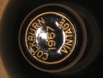
Page 128 and the index: ‟Calém”? ‟Calém”! ‟Calém”✠˜
Odd text decoration in ‟2000 Sandeman’s Vau Vintage”.
Thanks: these were all typos (many of which were in my tasting note database).
jdaw1 wrote:On the cover the ‟Po” of ‟Port” needs kerning (and in ‟Ruby Port”, ‟Crusted Port”, &c.). Also the ‟Ye” in the various instances of ‟Years”, and ‟Ta” in ‟Tawny”.
You are a fan of Gentium. But, for my taste, large footless ‘b’s, such as that in the title, have the appearance of being on the edge of toppling.
Consider automatically small-capping ‟LBV” and ‟VP”. And could ‟Y/O” become a suitably kerned ‟Y.O.”, or even just ‟YO”?
These are font-related issues. Although I do like Gentium, it is mostly a placeholder. I am more than welcome to receive suggestions as to what would be a good typeface for such a book.
jdaw1 wrote:On the front cover the decanter stopper is odd, and you have two decanters with only one glass.
In addition to AHB’s explanation, this was a drawing in registration depicting two scenes: the opening and pouring of a decanter of Port. If this was unobvious, I prescribe some consideration of objects such as Ur-Nanshe’s plaque and the Stele of the Vultures which are both, I believe, on the ground floor, Richelieu section, in the Louvre.
jdaw1 wrote:For the pre-entered TNs, is it worth removing the series of dots?
Yes, and I think possibly also some of the other descriptions (e.g. if it is in a 10-Year-Old Tawny section, it does not need to be described as ‟NV Graham 10-Year-Old Tawny”; ‟Graham” should suffice).
jdaw1 wrote:Have a single paragraph, broken only by the italics.
- Port: 1884 Sandeman VP. Drunk: TPF Christmas Tasting, 17xii2009. Observations: Obviously extremely old. A pale golden colour. Still very drinkable. Huge amounts of rosemary on the nose. A great bottle to have tried.
I am slightly less keen on this, mostly because I prefer some more whitespace.
jdaw1 wrote:In the index, can page numbers be clickable, jumping to the relevant page? Not relevant on paper; nice in PDF.
Yes, though the script I am using has two options: either make a hyperlink to the top of the page page or make a hyperlink to the exact entry, with the later resulting in duplication of duplicate entries (i.e. Warre 1983 has an entry of ‟44, 44” with each reference being a link to a different mention of it on the same page).
jdaw1 wrote:Should the pages be A5, so the paper folded A4?
I thought it was.
jdaw1 wrote:In the index the Cálem ports have a problem with sort-order. Presumably the machine thinks that ‘á’ > ‘z’.The index also sorts all ‘Quinta’s together: was this deliberate?
Reading the manual suggests I will have to manually adjust the entry for Cálem before printing since the script does not like accents. The Quintas are sorted together because that is how they are stored in my tasting notes. It is not something that bothers me, though it could be adjusted for others.
jdaw1 wrote:In ‟Generally Declared Years Since 1850” why not link split declarations with an ‟and”: ‟1960, 1963, 1966 and 1967,”?
Hmm...Perhaps some sort of slash might convey the information more clearly without giving the impression that it is a misplaced end-of-list conjunctive?
jdaw1 wrote:‟A Selection of Significant Dates” should include events of our royalty: new monarchs, marriages, children, jubilees, etc.
I welcome suggestions of what can be included and what can be expunged, noting the amount of space available.