2011 Declarations

Re: 2011 Declarations
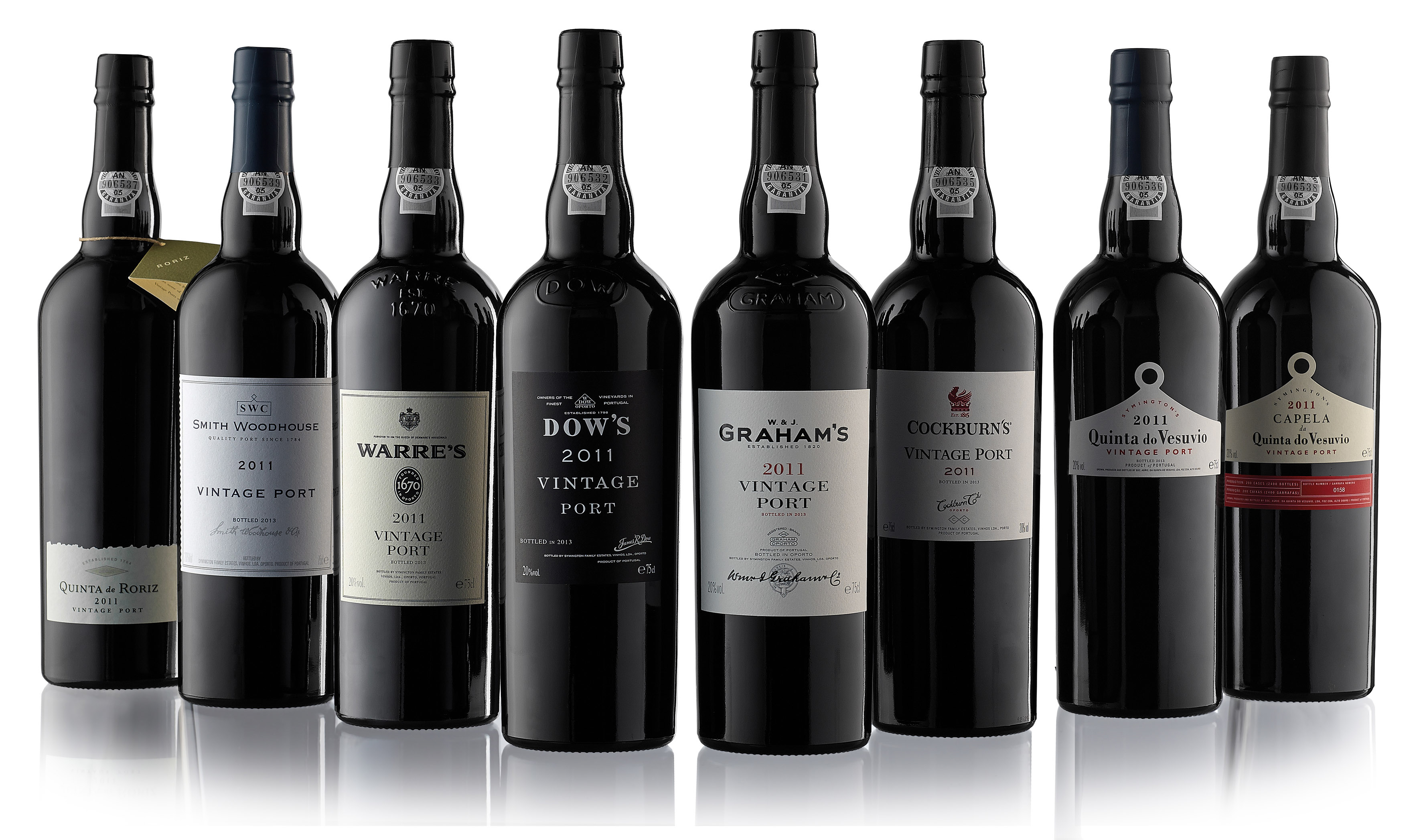
At full resolution the whole photo looked photo-shopped. Perhaps the bottles were photographed separately, then brought together edge selection seemed hard rather than soft.
-
uncle tom

- Dalva Golden White Colheita 1952
- Posts: 3520
- Joined: 23:43 Wed 20 Jun 2007
- Location: Near Saffron Walden, England
Re: 2011 Declarations
Note new design of Cockburn label. Slightly in the shadows in this pic, but an improvement on the old design, which always looks a bit clumsy..
I may be drunk, Miss, but in the morning I shall be sober and you will still be ugly - W.S. Churchill
-
djewesbury
- Graham’s 1970
- Posts: 8165
- Joined: 20:01 Mon 31 Dec 2012
- Location: Gothenburg, Sweden
- Contact:
Re: 2011 Declarations
The Capela da Quinta do Vesuvio is missing. I presume that since the Stone Thingummy picture was sent separately, that these are just the main brands and not the top-end labels.
Daniel J.
Husband of a relentless former Soviet Chess Master.
delete.. delete.. *sigh*.. delete...
Husband of a relentless former Soviet Chess Master.
delete.. delete.. *sigh*.. delete...
Re: 2011 Declarations
! the rightmost bottle.djewesbury wrote:The Capela da Quinta do Vesuvio is
-
uncle tom
- Dalva Golden White Colheita 1952
- Posts: 3520
- Joined: 23:43 Wed 20 Jun 2007
- Location: Near Saffron Walden, England
Re: 2011 Declarations
Noval Nacional confirmed.
I may be drunk, Miss, but in the morning I shall be sober and you will still be ugly - W.S. Churchill
-
djewesbury
- Graham’s 1970
- Posts: 8165
- Joined: 20:01 Mon 31 Dec 2012
- Location: Gothenburg, Sweden
- Contact:
Re: 2011 Declarations
..is the Quinta do Vesuvio. Or is the rightmost rightmost bottle perhaps cropped from the image..?jdaw1 wrote:! the rightmost bottle.djewesbury wrote:The Capela da Quinta do Vesuvio is
Daniel J.
Husband of a relentless former Soviet Chess Master.
delete.. delete.. *sigh*.. delete...
Husband of a relentless former Soviet Chess Master.
delete.. delete.. *sigh*.. delete...
Re: 2011 Declarations
Not on my screen. Right-click and open image in new tab.djewesbury wrote:Or is the rightmost rightmost bottle perhaps cropped from the image..?
Re: 2011 Declarations
An updated picture from Cynthia J.

Re: 2011 Declarations
On a laptop with 11 inch screen it appears cropped. On a desk-top it is fine.jdaw1 wrote:Not on my screen. Right-click and open image in new tab.djewesbury wrote:Or is the rightmost rightmost bottle perhaps cropped from the image..?
Rob C.
Re: 2011 Declarations
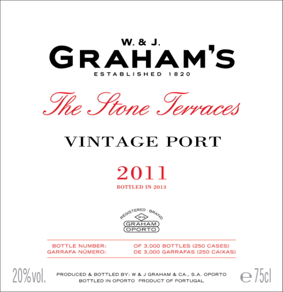
Just to clarify - updated photo of Stone Terraces label corrects the bottle count to final bottling - 250 cases / 3000 bottles - original photo was a draft label before we knew final numbers.
-
PhilW
- Dalva Golden White Colheita 1952
- Posts: 3517
- Joined: 14:22 Wed 15 Dec 2010
- Location: Near Cambridge, UK
Re: 2011 Declarations
I've only seen the lower resolution version, but I don't think this is a composite, assuming they are actually real bottles (vs graphic designer generated) due to the bottle reflections. There is clearly a strong light source from the right, behind the bottles onto the background, and at least a softer light from the front left side; The silhouettes of the other bottles within the reflection on the top left reflections on the Cockburn's and Vesuvio bottles appear proportionate and appropriate for positioning, so this would most likely be a real setup, unless a very high quality ray-traced image. From the inconsistency in aliasing pattern on the thin lines at the edge of the Warre label, I would suggest you may be right that the label is a tiny fraction rotated, which would also suggest the image is real and not ray-traced.jdaw1 wrote:At full resolution the whole photo looked photo-shopped. Perhaps the bottles were photographed separately, then brought together edge selection seemed hard rather than soft.
The main photo-shopped effect is probably a consequence of the high contrast, plus perhaps auto-sharpening within the camera (many cameras have this set a little high by default in my opinion to cope ideally with high-contrast images with narrow light/dark bands especially when vertical/horizontal).
Last edited by PhilW on 12:31 Mon 22 Apr 2013, edited 2 times in total.
Re: 2011 Declarations
I defer to PhilW’s greater expertise.
-
djewesbury
- Graham’s 1970
- Posts: 8165
- Joined: 20:01 Mon 31 Dec 2012
- Location: Gothenburg, Sweden
- Contact:
Re: 2011 Declarations
You've got a few dummy bottles, a photo studio, two or three lamps and a photographer. Why would you spend thousands recreating a scene that takes an hour to set up and photograph in real life..?jdaw1 wrote:I defer to PhilW’s greater expertise.
Daniel J.
Husband of a relentless former Soviet Chess Master.
delete.. delete.. *sigh*.. delete...
Husband of a relentless former Soviet Chess Master.
delete.. delete.. *sigh*.. delete...
-
uncle tom
- Dalva Golden White Colheita 1952
- Posts: 3520
- Joined: 23:43 Wed 20 Jun 2007
- Location: Near Saffron Walden, England
Re: 2011 Declarations
I like the bottle serial number on the Stone Terraces label, together with the total amount bottled, but I do hope they don't pack it in silly presentation boxes..
Co-stacking the various case shapes - Vesuvio/Senhora da Ribeira/VVV - with the various regular wooden cases is an absolute nightmare.
I would so love to see the producers sit down and agree a standard size six pack design for all vintage port - if the various warring factions in Bordeaux can agree on packaging, why can't the Port producers?
I may be drunk, Miss, but in the morning I shall be sober and you will still be ugly - W.S. Churchill
-
PhilW
- Dalva Golden White Colheita 1952
- Posts: 3517
- Joined: 14:22 Wed 15 Dec 2010
- Location: Near Cambridge, UK
Re: 2011 Declarations
Having seen the full resolution image, definitely a real pic; Lots of minor ephemera indicating real, not generated, including:
-- minor tear on Capela capsule
-- minor fold on Cockburn capsule
-- tiny corner of back bottom label on Vesuvio peeking out
Some interesting further details looking at the full image:
- Warre label probably not skew after all, just a consequence of lighting angles, (significant) aliasing only in smaller version
- Cockburn bottle has marking 12-29 on the bottom right; bottle manufacture date, or labelling following fill, I wonder?
- Sequential selos
- Quinta de Roriz is the only one not to have a ‟bottled by” statement on the front label
Re: 2011 Declarations
Original image sent to me, for those who care. But big: 2,034,769 bytes, 3543”†×”†2094 pixels. And the meta-tags have camera information.
(Yes, this is pointless. But as we haven’t tasted the juice we’ll discuss the photographs of the bottles. It is what we have.)
Suggesting dummy bottles.PhilW wrote:Sequential selos
(Yes, this is pointless. But as we haven’t tasted the juice we’ll discuss the photographs of the bottles. It is what we have.)
Re: 2011 Declarations
The publicity releases for the Symington brands quote alcohol, ‟Total acidity ”“ 4.20 (g/l)”, and Baumé. Sorted dry to sweet, they are:
Alc  Acid  Baumé  House
20% Â 4.3Â Â 3.4Â Â Cockburn
20% Â 4.55 Â 3.40 Â Dow
20% Â 4.10 Â 3.50 Â Quinta de Roriz
20% Â 4.60 Â 3.50 Â Capela da Quinta do Vesuvio
20% Â 4.35 Â 3.60 Â Graham’s The Stone Terraces
20% Â 4.10 Â 3.65 Â Warre
20% Â 4.10 Â 3.80 Â Smith Woodhouse
20% Â 4.20 Â 3.8Â Â Graham
20% Â 4.45 Â 3.90 Â Quinta do Vesuvio
-
PhilW
- Dalva Golden White Colheita 1952
- Posts: 3517
- Joined: 14:22 Wed 15 Dec 2010
- Location: Near Cambridge, UK
Re: 2011 Declarations
Scary. I'd just been looking at the difference between G11 and G11-Stone-Terraces (GST11 ?), and created a similar list of Graham over time, to try and see what this might suggest:jdaw1 wrote:The publicity releases for the Symington brands quote alcohol, ‟Total acidity ”“ 4.20 (g/l)”, and Baumé. Sorted dry to sweet, they are:
Alc Acid Baumé Year
20% 4.05 3.9 1970
20% 4.05 2.9 1977
20% 4.13 3.6 1985
20% 4.13 3.8 1991
20% 4.80 3.4 1994
20% 4.20 3.8 2011
20% 4.35 3.6 2011-Stone-Terraces
I admit this didn't give me any great insight, though. Will be very interesting to compare them directly.
Also noted that the Niepoort 11 and N11-Bioma (NiB11 ?) are much higher acidity (5.06 and 5.36) by comparison.
Re: 2011 Declarations
Baumé on x axis, total acidity on y, for those 2011 Vintage Ports for which data available, and some others.
Please let me know of other data that can be added.
Please let me know of other data that can be added.
-
djewesbury
- Graham’s 1970
- Posts: 8165
- Joined: 20:01 Mon 31 Dec 2012
- Location: Gothenburg, Sweden
- Contact:
Re: 2011 Declarations
I thought it was the Dow? Now that I'm looking at the original full-res image on my large desktop screen that one does indeed appear to be skew..PhilW wrote:- Warre label probably not skew after all, just a consequence of lighting angles, (significant) aliasing only in smaller version
What is the missing 906534 supposed to represent? Do we have a numerologist handy? The digits add up to 9. which is 3x3.. is that inauspicious on the burgeoning Chinese market?PhilW wrote:- Sequential selos
but makes up for it by having a silly bit of card tied to it with some string. Surely the worst job in the bottling plant?PhilW wrote:- Quinta de Roriz is the only one not to have a ‟bottled by” statement on the front label
Daniel J.
Husband of a relentless former Soviet Chess Master.
delete.. delete.. *sigh*.. delete...
Husband of a relentless former Soviet Chess Master.
delete.. delete.. *sigh*.. delete...
Re: 2011 Declarations
Presumably the strangely absent Stone Terraces.djewesbury wrote:What is the missing 906534 supposed to represent?
Re: 2011 Declarations
i'd hazard to guess these bottles were taking on top of graham's light tasting table but I could be wrongPhilW wrote:I've only seen the lower resolution version, but I don't think this is a composite, assuming they are actually real bottles (vs graphic designer generated) due to the bottle reflections. There is clearly a strong light source from the right, behind the bottles onto the background, and at least a softer light from the front left side; The silhouettes of the other bottles within the reflection on the top left reflections on the Cockburn's and Vesuvio bottles appear proportionate and appropriate for positioning, so this would most likely be a real setup, unless a very high quality ray-traced image. From the inconsistency in aliasing pattern on the thin lines at the edge of the Warre label, I would suggest you may be right that the label is a tiny fraction rotated, which would also suggest the image is real and not ray-traced.jdaw1 wrote:At full resolution the whole photo looked photo-shopped. Perhaps the bottles were photographed separately, then brought together edge selection seemed hard rather than soft.
The main photo-shopped effect is probably a consequence of the high contrast, plus perhaps auto-sharpening within the camera (many cameras have this set a little high by default in my opinion to cope ideally with high-contrast images with narrow light/dark bands especially when vertical/horizontal).
Disclosure: Distributor of Quevedo wines and Quinta do Gomariz
Re: 2011 Declarations
^^ This, my cellar looks like a random mess stacking boxesuncle tom wrote:
I would so love to see the producers sit down and agree a standard size six pack design for all vintage port - if the various warring factions in Bordeaux can agree on packaging, why can't the Port producers?
Disclosure: Distributor of Quevedo wines and Quinta do Gomariz
Re: 2011 Declarations
it's acutally a failed analogy to consider a higher baumé a "sweeter" brew.PhilW wrote:Scary. I'd just been looking at the difference between G11 and G11-Stone-Terraces (GST11 ?), and created a similar list of Graham over time, to try and see what this might suggest:jdaw1 wrote:The publicity releases for the Symington brands quote alcohol, ‟Total acidity ”“ 4.20 (g/l)”, and Baumé. Sorted dry to sweet, they are:
Alc Acid Baumé Year
20% 4.05 3.9 1970
20% 4.05 2.9 1977
20% 4.13 3.6 1985
20% 4.13 3.8 1991
20% 4.80 3.4 1994
20% 4.20 3.8 2011
20% 4.35 3.6 2011-Stone-Terraces
I admit this didn't give me any great insight, though. Will be very interesting to compare them directly.
Also noted that the Niepoort 11 and N11-Bioma (NiB11 ?) are much higher acidity (5.06 and 5.36) by comparison.
It's simply a measure of density that loosely translates to residual sugar. What that simply tells me is that the 1977 G is one of the most "Watery" ports grahams has produced and if you taste the vintages you listed side by side, I would almost guarantee that most of us could pick out the 77 from the lot.
Disclosure: Distributor of Quevedo wines and Quinta do Gomariz