For the
GC + SW + QH triple vertical on Thu 17 Nov 2011, RAYC made several similar versions of the placemats, and then overlapped the printouts to simulate the following A3 arrangement.
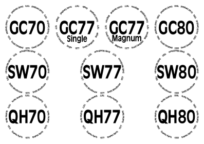
Of course this overlapping of multiple copies is unacceptable.
Currently the array parameter
PermittedPackingStyles may contain any of (and must contain at least one of)
/PseudoHexagonal,
/SquareGrid,
/RectangularDislocation,
/RectangularDislocationV,
/TwoRowsOrTwoColumns,
/GaiaElegant,
/Gaia, or
/Irregular or one of its variants. None of these do quite what RAYC required.
The proposal is to allow
PermittedPackingStyles to contain an array, at least as long as the number of glasses on the page. That array would contain sub-arrays of locations,
[ x y ]. My code would then choose the radius and separately scale the
x and
y directions such that things fit as snugly as possible, obviously subject to the other upper bounds on the radius. That gives the technical user a lot of control over the rare complicated cases, whilst the usual name parameters still cope with the vast majority of arrangements that could be wanted.
In the particular case of the GC+SW+QH tasting, the element of
PermittedPackingStyles could have been
[ [0 2] [2 2] [4 2] [6 2] [0 1] [3 1] [6 1] [0 0] [3 0] [6 0] ]. Observe that this example assumes that positive
y points north. This echoes the usual PostScript convention; but conflicts with the usual page arrangements in which glasses with a small
WithinPage are at the top.
Thoughts? Comments? Views on which direction positive
y should be? Bottle of Taylor 1977?
(This post the last on this page. Please could the first to reply to it quote it, except this line.)