The vintage, in big white letters, is typeset in text figures. For those not immediately flustered by this, there are two styles of numbers for typesetting. Numbers can be on the baseline, and the same size as capital letters: lining figures. Or they can be similar to lower-case text, the ‘g’ and the ‘9’ having similarly positioned circles, and similarly positioned descenders: text figures.
So examine the label of the imperial of F85. The elements of similar visual strength to the vintage, “FONSECA” and “VINTAGE PORT” are in upper-case. The “1985” should have been in ‘upper-case’ numbers (lining figures), rather than ‘lower-case’ (text figures). Indeed, the italicised bottling year, 1987, correctly uses lining figures.
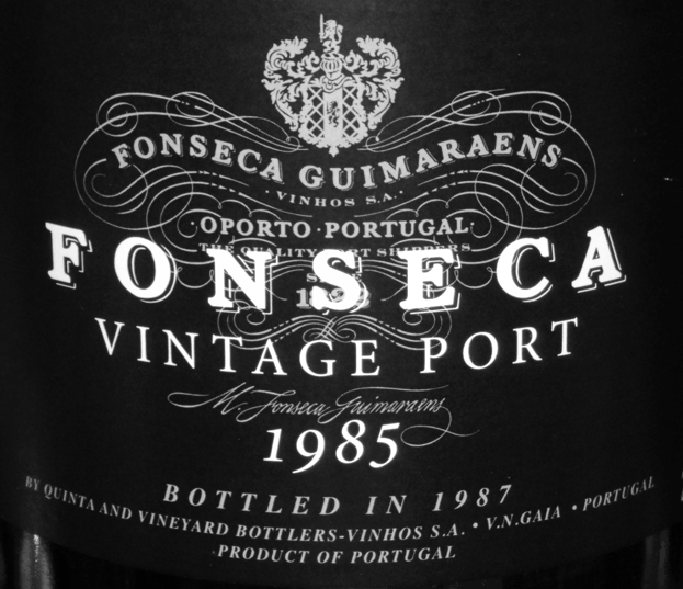
However, I acknowledge that this is a minor concern. If all humanity’s problems were listed, this upset might not quite make the first page.
Background reading: David Bergsland, Using numbers in the proper case.