jdaw1 wrote: ↑17:29 Fri 24 Dec 2021
uncle tom wrote: ↑21:41 Thu 23 Dec 2021The best, but most tedious addition (traditionally) would be the inclusion of a master index - where every subject title and proper noun gets page referenced.
What for? What have you sought and been unable to find?
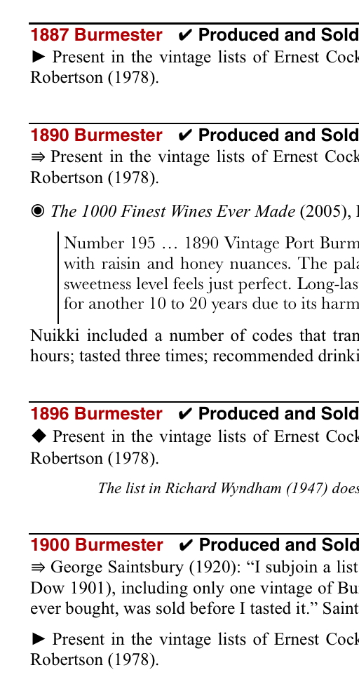
I have to confess to being slightly defeated by the indices in the book. I’ve used the it for three main purposes: to see who declared a given vintage; to see which years a particular shipper declared; and to check the provenance of a specific unusual bottle.
The first category is pretty easy: there are very helpful tables towards the back. The second and third categories are rather more difficult. If, for example, I want to see what vintages were declared by Andresen or if a 1983 Quinta do Seixo was commercially available; I’d normally start by turning to the index and looking for “Andresen” and either “Quinta ... Seixo (do)”; or “Seixo, Quinta do”. I think none of these options are available.
My next step would be to look in the Table of Contents but this doesn’t provide details of shippers that are in the “Other Shippers” section nor of single Quintas. When in this situation previously, I’ve therefore flicked through the “Other Shippers” section which sometimes helps but sometimes does not.
I appreciate that once someone gets into the text everything is well referenced (e.g. if I thought to look in the Sandeman chapter for Quinta do Seixo, I’d find the reference to the fact that the 1983 and 1982 are actually located in the Ferreira chapter) but it is not immediately clear to me how to do that without some external knowledge.
I fully accept I may be doing something wrong and if so I apologise, but I have had the above problem a couple of times!


