Page 1 of 1
A very poor graphic!
Posted: 09:24 Sun 23 Sep 2012
by DRT
On
Sky's F1 website today is a graphic showing the results of a Poll.
Can you spot the problem?
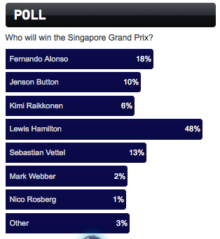
- Screen shot 2012-09-23 at 10.20.33.png (25.16 KiB) Viewed 6251 times
Re: A very poor graphic!
Posted: 16:02 Sun 23 Sep 2012
by Andy Velebil
They seem to be a tad off in their total count...by 1. Opps!
Re: A very poor graphic!
Posted: 18:02 Sun 23 Sep 2012
by DRT
Andy Velebil wrote:They seem to be a tad off in their total count...by 1. Opps!
I didn't notice that. There is a bigger problem.
Re: A very poor graphic!
Posted: 18:35 Sun 23 Sep 2012
by Andy Velebil
It seems Luis Hamilton didn't fair so well, coming in 24th place

. Otherwise they did make the 1, 2, 3, 6, etc blue bars rather close in length compared to the 48% bar. In other words, not proportional
Re: A very poor graphic!
Posted: 18:56 Sun 23 Sep 2012
by PhilW
Indeed, very poor. Fixed offset addition, by the looks (or failure to separate legend from proportional bar) - the general opposite of what seems to be done in a high proportion of political polls these days (big or little P), where the aim is demonstrate that the people with a 31.5% view are overwhelmingly more significant than those holding the 30.5% view; by basing the scale with 30 as the axis...
Re: A very poor graphic!
Posted: 19:18 Sun 23 Sep 2012
by RAYC
obvious....should be "Räikkönen"
Re: A very poor graphic!
Posted: 19:34 Sun 23 Sep 2012
by DRT
PhilW wrote:Indeed, very poor. Fixed offset addition, by the looks (or failure to separate legend from proportional bar) - the general opposite of what seems to be done in a high proportion of political polls these days (big or little P), where the aim is demonstrate that the people with a 31.5% view are overwhelmingly more significant than those holding the 30.5% view; by basing the scale with 30 as the axis...
Top marks!
I suspect this is a case of those who promote F1 trying to make the potential outcome look closer (and therefore more exciting) than it is likely to be in reality.
Re: A very poor graphic!
Posted: 19:35 Sun 23 Sep 2012
by DRT
RAYC wrote:obvious....should be "Räikkönen"
20 bonus points for pedantry
