Page 1 of 2
A Placemat Consistency Problem
Posted: 19:04 Mon 23 Feb 2015
by djewesbury
I will write this post in such a manner as to make it accessible to those who have not used the placemat software. I welcome all responses.
I organise a number of introductory port tastings, for groups of various levels of prior knowledge. Usually these tastings include wines of various styles - typically a white, some Tawnies With Indication of Age (TWIOA), a good LBV and a couple of vintage ports.
I always make placemats for these events, but increasingly I find that I am unhappy with the results. Why? Because the titles (and variants and derivatives thereof) in the circle for each glass are inevitably trying to convey all kinds of different information, which is not standard from glass to glass. I'll illustrate this with an example from a forthcoming tasting.
The line-up for the tasting is as follows:
- Niepoort Dry White
- Graham 10YO Tawny
- Sandeman 20YO Tawny
- Warre Unfiltered LBV 2003
- Smith Woodhouse 1991 VP
- Gould Campbell 1983 VP
(This line-up is already fixed and unchangeable, so please don't post recommendations. The point of these wines is that they are available locally, either via existing suppliers or by special arrangements: the two vintages are being supplied through a local merchant that already has an arrangement with Fells, and that already supplies the club where this tasting is being held, by way of example.)
The wines are of four different categories, and the description of each category requires particular information. This is not standard; in some cases the shipper name is more important, in others the designation of age, or the style. On the other hand, when we make placemats, we like to use the various levels of Title information - Titles, Abovetitles, Belowtitles, and Overtitles - for the same class of information in each circle. This is impossible when the classes of information are not uniform.
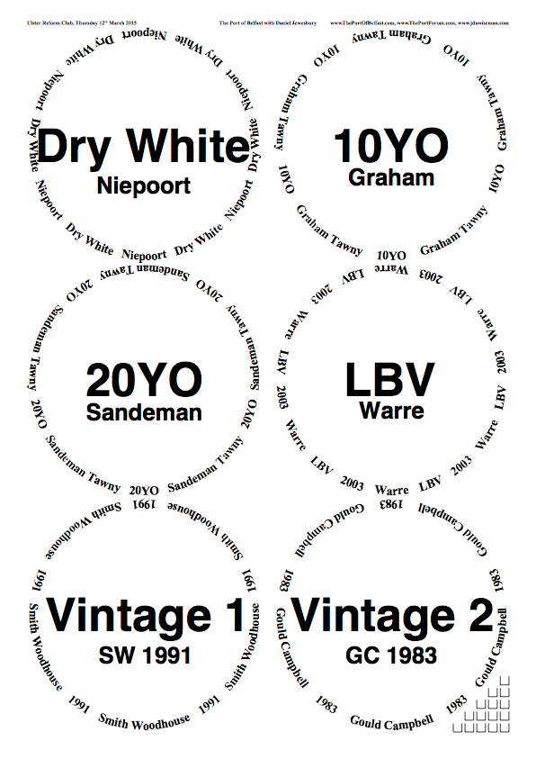
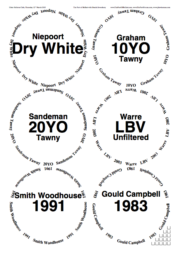
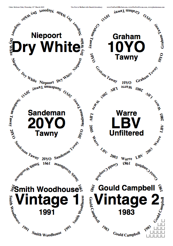
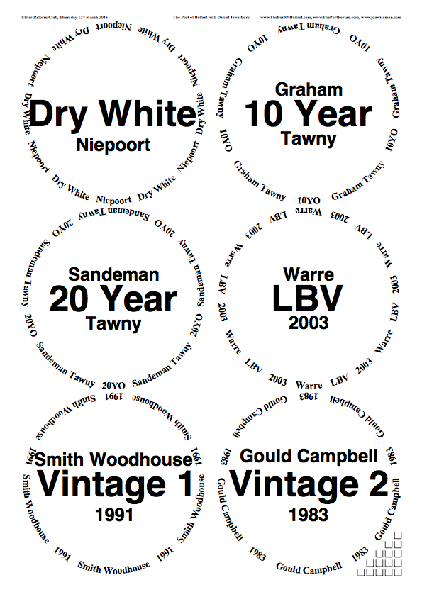
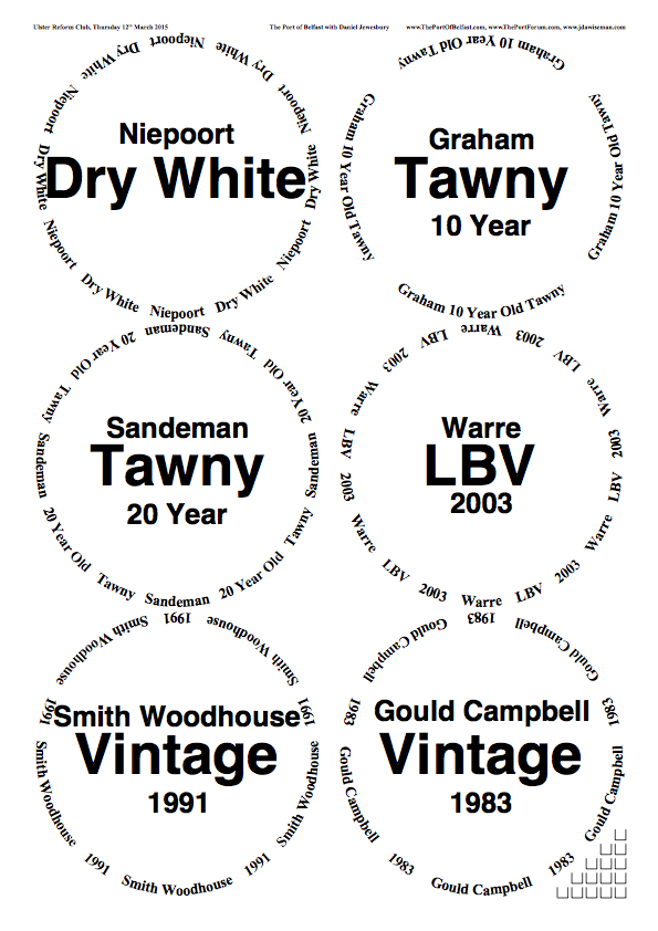
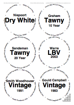
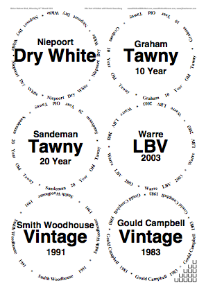
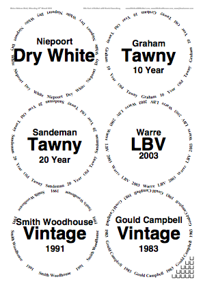
Below are three examples of sample placemats which are all ugly to my eye, and which I cannot see a simple way to standardise that is both aesthetically pleasing, and informationally efficient. In the first example, there is a certain level of uniformity, but it feels ugly overall and the bottom two circles feel a bit messy. In the second example, the information is a little more standardised but the whole thing is unbalanced and ugly. The final example is a different variant of the same problem.
Placemat makers: I have not used Overtitles in any example simply because there is no single standard piece of information, apart from shipper names, that is common across all categories. I want to avoid using shipper abbreviations (as used in the first example) as these are not meaningful outside of this padded cell; but 'Smith Woodhouse' is so much longer a string than 'Warre' that it is impractical to use these as Overtitles.
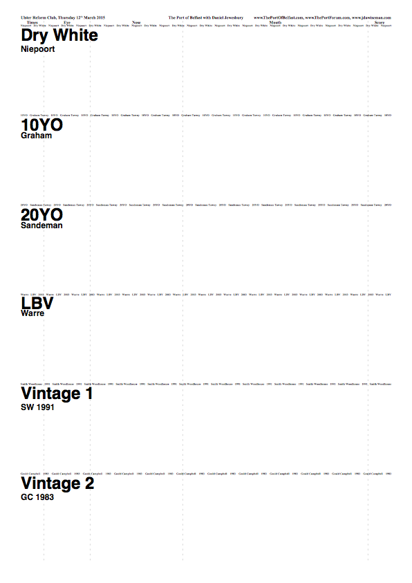
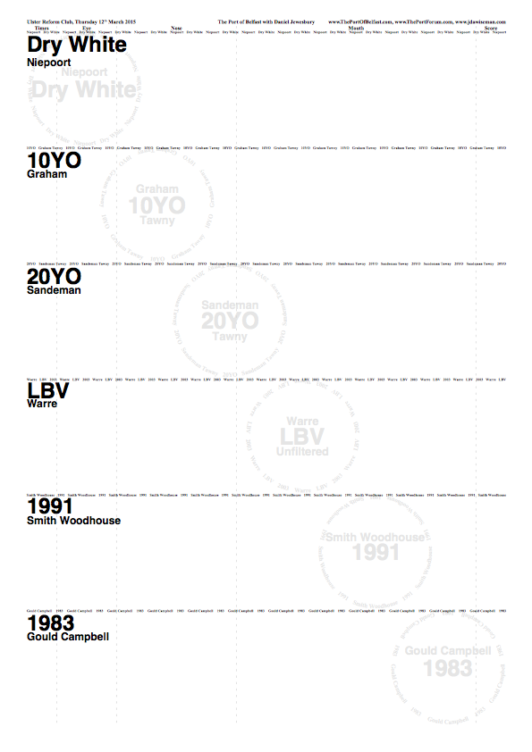
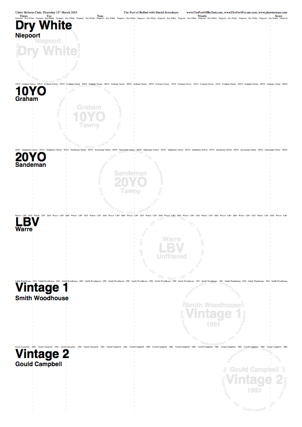
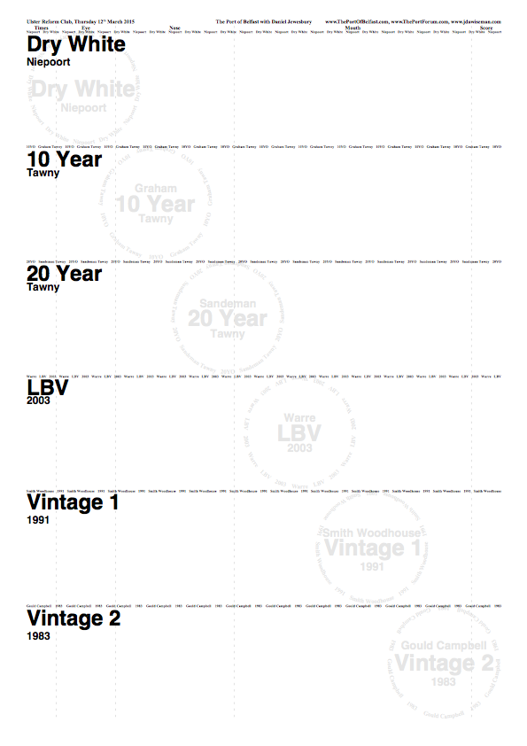
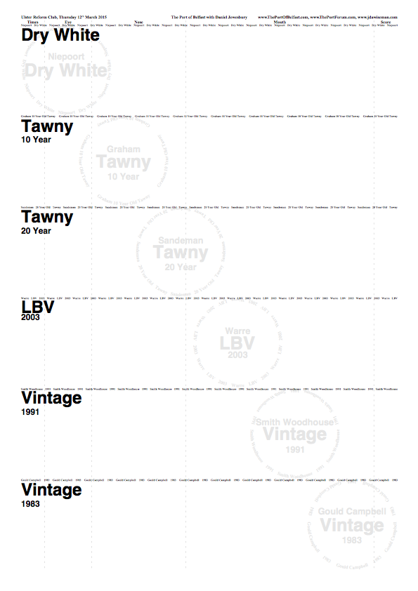
Here are the examples, please post your thoughts. Going on past form, I expect to disagree with everything everyone says, but hopefully that will enable me to have a better idea of mine own. I include the TN pages as these give you an idea of how the different uses of Title elements feed through to the information displayed on those pages. Note: these PNGs do not link to larger images or PDFs.
Example One
 Example Two
 Example Three
Re: A Placemat Consistency Problem
Posted: 19:49 Mon 23 Feb 2015
by jdaw1
djewesbury wrote:The wines are of four different categories, and the description of each category requires particular information. This is not standard; in some cases the shipper name is more important, in others the designation of age, or the style. On the other hand, when we make placemats, we like to use the various levels of Title information - Titles, Abovetitles, Belowtitles, and Overtitles - for the same class of information in each circle. This is impossible when the classes of information are not uniform.
Your data doesn’t have consistent fields, so its presentation can’t be perfectly consistent. Get used to it.
My preference would be to put the shipper abbreviations in the
Titles, the age or vintage in the
Abovetitles, and the type in the
Belowtitles. The
Circlearrays could contain much the same, except using a full or nearly-full shipper name instead of the abbreviation.
Re: A Placemat Consistency Problem
Posted: 19:55 Mon 23 Feb 2015
by djewesbury
Thank you, and how lucky are we that useful suggestion no. 1 from The Source itself?! Will post an example of the suggested variant.
Re: A Placemat Consistency Problem
Posted: 20:09 Mon 23 Feb 2015
by flash_uk
Is there a way to have abovetitles text wrap upwards, so it would look like:
Gould
Campbell
Edit: hmmm...can't get it to look the way I intended. Imagine the "Gould" is a little indented and centred above the Campbell.
Re: A Placemat Consistency Problem
Posted: 20:22 Mon 23 Feb 2015
by flash_uk
Also, are you not muddling up some of the categories of information you are trying to convey? Example 3 looks the most promising, but in that example, belowtitle for the Graham 10YO gives the style (tawny), but belowtitle for the Warre is not the style, which in that case is given in the title (LBV). There are only really 3 major categories of information: Shipper, Style, Age/Year
For your bottles, this would be:
Niepoort, Dry White, [blank]
Graham, Tawny, 10YO
Sandeman, Tawny, 20YO
Warre, Unfiltered LBV, 2003
Smith Woodhouse, VP, 1991
Gould Campbell, VP, 1983
Re: A Placemat Consistency Problem
Posted: 20:23 Mon 23 Feb 2015
by djewesbury
flash_uk wrote:Is there a way to have abovetitles text wrap upwards, so it would look like:
Gould
Campbell
Edit: hmmm...can't get it to look the way I intended. Imagine the "Gould" is a little indented and centred above the Campbell.
No there ain't. Each Title element can be only one line long. Any change would require a change to the software.
Re: A Placemat Consistency Problem
Posted: 20:25 Mon 23 Feb 2015
by flash_uk
djewesbury wrote:No there ain't. Each Title element can be only one line long. Any change would require a change to the software.
Sometimes "The One" has been known to get his coding fingers out and make such adaptations happen...
Re: A Placemat Consistency Problem
Posted: 20:26 Mon 23 Feb 2015
by djewesbury
flash_uk wrote:Also, are you not muddling up some of the categories of information you are trying to convey? Example 3 looks the most promising, but in that example, belowtitle for the Graham 10YO gives the style (tawny), but belowtitle for the Warre is not the style, which in that case is given in the title (LBV). There are only really 3 major categories of information: Shipper, Style, Age/Year
For your bottles, this would be:
No. This is an illustration of the point I'm making. There can be more than one secondary or tertiary attribute and they have no similarity across categories. Which is more important, that it is unfiltered, that it is 2003, or that it is LBV? And how does that translate to a Graham 10YO Tawny? It does, but differently.
Re: A Placemat Consistency Problem
Posted: 20:27 Mon 23 Feb 2015
by djewesbury
flash_uk wrote:djewesbury wrote:No there ain't. Each Title element can be only one line long. Any change would require a change to the software.
Sometimes "The One" has been known to get his coding fingers out and make such adaptations happen...
Indeed. But it would actually be a monumentally complicated alteration from what I understand and it would reduce the usability of a piece of software that is already minimally user friendly. And the effort required would not be commensurate with the use expected.
Re: A Placemat Consistency Problem
Posted: 20:43 Mon 23 Feb 2015
by PhilW
You've already said this is not for geeks (though must be acceptable to them). I would therefore drop the "unfiltered" which you can talk to them about anyway. pd2pdf isn't working for me at the moment, so I couldn't try the following to check look and font sizes, but I was going to try this:
Code: Select all
/Circlearrays [
	[ (Niepoort) (Dry White) ]
	[ (Warre) (LBV) (2003) ]
	[ (Graham) (10YO Tawny) ]
	[ (Sandeman) (20YO Tawny) ]
	[ (Smith Woodhouse) (Vintage) (1991) ]
	[ (Gould Campbell) (Vintage) (1983) ]
] def

/Abovetitles [
	(Niepoort)
	(Warre)
	(Graham)
	(Sandeman)
	(Smith Woodhouse)
	(Gould Campbell)
] def

/Titles [
	(White)
	(LBV)
	(Tawny)
	(Tawny)
	(Vintage)
	(Vintage)
] def

/Belowtitles [
	(Dry)
	(2003)
	(10yr)
	(20yr)
	(1991)
	(1983)
] def
which I think is consistent in terms of the info per line (shipper, style, variant); I moved the LBV up so that the two tawnies sat next to each other on the middle row, as the two vintages do on the bottom row, and slightly re-ordered the words on the circlearrays to what I felt would be more natural. I would also want to ensure that the middle row is not disproportionately large font.
Re: A Placemat Consistency Problem
Posted: 20:47 Mon 23 Feb 2015
by djewesbury
I will copy and paste this and post the result. I don't want to put the LBV before the tawnies however, as it makes no sense to alternate between wood-aged and bottle-aged ports, and will only confuse an audience. Better to progress in an orderly way through the styles. The placemat should not be the dictator of the logical course of the evening.
Re: A Placemat Consistency Problem
Posted: 20:51 Mon 23 Feb 2015
by PhilW
djewesbury wrote:I will copy and paste this and post the result. I don't want to put the LBV before the tawnies however, as it makes no sense to alternate between wood-aged and bottle-aged ports, and will only confuse an audience. Better to progress in an orderly way through the styles. The placemat should not be the dictator of the logical course of the evening.
Then perhaps I would use landscape rather than portrait, with one line of white/tawny and the other of LBV/vintage.
But only perhaps, since I haven't seen how that would look.
Agree that your choice should drive the order, even better if the placemats can support the flow.
Re: A Placemat Consistency Problem
Posted: 20:57 Mon 23 Feb 2015
by djewesbury
I will copy and paste this and post the result. I don't want to put the LBV before the tawnies however, as it makes no sense to alternate between wood-aged and bottle-aged ports, and will only confuse an audience. Better to progress in an orderly way through the styles. The placemat should not be the dictator of the logical course of the evening.
Re: A Placemat Consistency Problem
Posted: 21:02 Mon 23 Feb 2015
by PhilW
Is there an echo in here...
Re: A Placemat Consistency Problem
Posted: 21:14 Mon 23 Feb 2015
by jdaw1
Splitting the
(Dry White) feels odd to me.
djewesbury wrote:But it would actually be a monumentally complicated alteration from what I understand and it would reduce the usability of a piece of software that is already minimally user friendly. And the effort required would not be commensurate with the use expected.
Not going to happen, for the reasons given. (It can be done, by inserting lots of complicated code into the parameter, but don’t do that.)
Re: A Placemat Consistency Problem
Posted: 21:45 Mon 23 Feb 2015
by jdaw1
PhilW wrote:pd2pdf isn't working for me at the moment
PS2PDF.com seems to be broken. Try
online2pdf.com/convert-ps-to-pdf.
Re: A Placemat Consistency Problem
Posted: 21:58 Mon 23 Feb 2015
by djewesbury
JDAW's solution
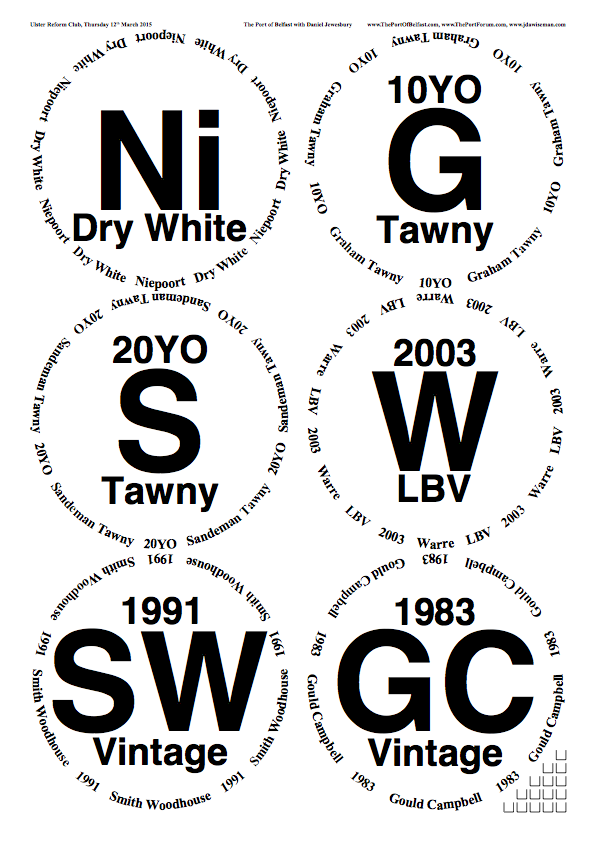
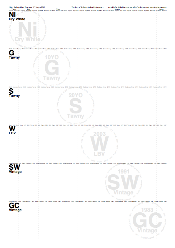
This has the merits of being completely incomprehensible to port novices, and having no useful information on the TN pages,
viz. how old are the tawnies? what year do the vintages come from? But that's easy, I hear you say, just change the subtitle on the TN pages to the Abovetitle, right? In that case, the first drink only has the wonderfully helpful 'Ni' and no further descriptor. How wonderfully JDAW, how thoroughly unusable. Obviously the only answer is to go against the nerds who would insist on 'comparability' even when it's meaningless.

Re: A Placemat Consistency Problem
Posted: 22:02 Mon 23 Feb 2015
by djewesbury
PhilW wrote:djewesbury wrote:I will copy and paste this and post the result. I don't want to put the LBV before the tawnies however, as it makes no sense to alternate between wood-aged and bottle-aged ports, and will only confuse an audience. Better to progress in an orderly way through the styles. The placemat should not be the dictator of the logical course of the evening.
Then perhaps I would use landscape rather than portrait, with one line of white/tawny and the other of LBV/vintage.
Not going to work with the number of attendees and the space available unfortunately (landscape glasses + TN = 507mm per person minimum, or else the glasses behind and the TN in front, which is unsatisfactory), but otherwise would have been an elegant solution.
Re: A Placemat Consistency Problem
Posted: 22:24 Mon 23 Feb 2015
by jdaw1
djewesbury wrote:viz. how old are the tawnies? what year do the vintages come from? But that's easy, I hear you say, just change the subtitle on the TN pages to the Abovetitle, right? In that case, the first drink only has the wonderfully helpful 'Ni' and no further descriptor. How wonderfully JDAW, how thoroughly unusable. Obviously the only answer is to go against the nerds who would insist on 'comparability' even when it's meaningless.
Fair criticism.
Re: A Placemat Consistency Problem
Posted: 22:38 Mon 23 Feb 2015
by djewesbury
The current solution
To me this has the following advantages, which outweigh the perhaps obvious disadvantages:
- The information on the glasses sheet is useful to the user, rather than 'correct' from the point of view of a bunch of geeks who won't be at the tasting. Shipper abbreviations are not used by anyone who hasn't been to a port tasting before and are not useful to them; likewise the abbreviations 10YO and 20YO.
- The information on the TN sheets is more generally useful, and probably aligns with what a novice wants to know: what style was the wine I liked (I can then ask / find out what the brand was).
Notwithstanding the inconsistency in the placement of the shipper names on the glasses sheet, I think that the rationale given above trumps other concerns.
Re: A Placemat Consistency Problem
Posted: 05:55 Tue 24 Feb 2015
by Glenn E.
I think I would like Julian's solution, but with the names spelled out. The abbreviations are obtuse for neophytes.
Re: A Placemat Consistency Problem
Posted: 08:04 Tue 24 Feb 2015
by DRT
I don't see the advantage of having Niepoort being used in a different place to the other shipper names. It doesn't need to be on the glasses sheet for the same reason that the others don't.
Re: A Placemat Consistency Problem
Posted: 08:42 Tue 24 Feb 2015
by djewesbury
Do you mean the tasting notes sheet Derek? I included it merely because it's the only qualifying descriptor there is. But I can see the sense in moving it.
Glenn, I just don't think that the shipper name is the most significant thing for, as you say, neophytes. Niepoort is a brand making many different types of port (indeed, Dirk has added several to the product list since I started typing this reply); the important characteristic is that it's the Dry White made by Niepoort.
Re: A Placemat Consistency Problem
Posted: 09:03 Tue 24 Feb 2015
by PhilW
DRT wrote:I don't see the advantage of having Niepoort being used in a different place to the other shipper names. It doesn't need to be on the glasses sheet for the same reason that the others don't.
+1
I would also change 20yr and 30yr to "Tawny 1" and "Tawny 2" following your convention, with 20y and 30yr underneath.
Re: A Placemat Consistency Problem
Posted: 09:19 Tue 24 Feb 2015
by djewesbury
PhilW wrote:
I would also change 20yr and 30yr to "Tawny 1" and "Tawny 2" following your convention, with 20y and 30yr underneath.
That's another useful suggestion - thanks.
Re: A Placemat Consistency Problem
Posted: 09:19 Tue 24 Feb 2015
by DRT
PhilW wrote:DRT wrote:I don't see the advantage of having Niepoort being used in a different place to the other shipper names. It doesn't need to be on the glasses sheet for the same reason that the others don't.
+1
I would also change 20yr and 30yr to "Tawny 1" and "Tawny 2" following your convention, with 20y and 30yr underneath.
+1
And change "LBV" to "Late Bottled Vintage", thereby eliminating all abbreviations.
Re: A Placemat Consistency Problem
Posted: 09:21 Tue 24 Feb 2015
by DRT
Actually, you don't need "1" and "2" after Vintage and Tawny as they have other qualifiers in the sub text on both sheets.
Re: A Placemat Consistency Problem
Posted: 09:23 Tue 24 Feb 2015
by PhilW
DRT wrote:And change "LBV" to "Late Bottled Vintage", thereby eliminating all abbreviations.
I think that would be too long for a single line on the glasses sheet, making the main text too small.
DRT wrote:Actually, you don't need "1" and "2" after Vintage and Tawny as they have other qualifiers in the sub text on both sheets.
+1
Re: A Placemat Consistency Problem
Posted: 09:26 Tue 24 Feb 2015
by DRT
PhilW wrote:DRT wrote:And change "LBV" to "Late Bottled Vintage", thereby eliminating all abbreviations.
I think that would be too long for a single line on the glasses sheet, making the main text too small.
Geek alert!
The purpose is to give non-geeks useful information, not to have all the text the same size.
Re: A Placemat Consistency Problem
Posted: 10:37 Tue 24 Feb 2015
by jdaw1
jdaw1 wrote:(It can be done, by inserting lots of complicated code into the parameter, but don’t do that.)
Don’t do
this.
Re: A Placemat Consistency Problem
Posted: 12:09 Tue 24 Feb 2015
by flash_uk
djewesbury wrote:PhilW wrote:
I would also change 20yr and 30yr to "Tawny 1" and "Tawny 2" following your convention, with 20y and 30yr underneath.
That's another useful suggestion - thanks.
That's the same suggestion I made up above that you rubbished!
Re: A Placemat Consistency Problem
Posted: 13:54 Tue 24 Feb 2015
by PhilW
DRT wrote:The purpose is to give non-geeks useful information, not to have all the text the same size.
Indeed, but they do
have to be able to read it
Re: A Placemat Consistency Problem
Posted: 15:41 Tue 24 Feb 2015
by djewesbury
flash_uk wrote:djewesbury wrote:PhilW wrote:
I would also change 20yr and 30yr to "Tawny 1" and "Tawny 2" following your convention, with 20y and 30yr underneath.
That's another useful suggestion - thanks.
That's the same suggestion I made up above that you rubbished!
It's subtly different. You suggested putting all the shipper information / vintage or age information on the same lines for the sake of consistency. This didn't appeal to me as it didn't seem usable and I didn't think consistency was the most important thing. The outcome of Phil's suggestion is the same as the outcome of yours, but now it's right for the right reason!


Re: A Placemat Consistency Problem
Posted: 15:42 Tue 24 Feb 2015
by djewesbury
PhilW wrote:DRT wrote:The purpose is to give non-geeks useful information, not to have all the text the same size.
Indeed, but they do
have to be able to read it
Agreed. This would not actually fit in and simultaneously not look rubbish. Aesthetics is a consideration; and LBV is a much more common abbreviation than YO.
Re: A Placemat Consistency Problem
Posted: 15:55 Tue 24 Feb 2015
by djewesbury
The latest version, including Phil's (and, alright, Mike's  ) suggestions:
Here, I have included two variants on the Circlearrays (non-geeks will understand that this is the text in the circle that comprises the ring for the base of the glass). The second Circlearray contains 'Graham 10 Year Old Tawny' as a single string, which I like as it makes sense, but which leaves a lot of space in between each of the four iterations of the string. The third Circlearray is arranged in the same way as the others, with the shipper name centred at the base of the circle: 'Sandeman', '20 Year Old' and 'Tawny' are each separate strings, so the spacing is more even, but I think I like it a little less. Obviously if I were going to go with the single-string method, they'd all have to be altered to fit in. But which do you prefer, and why?
In the past I have used asterisks as separators between strings; perhaps that's an option here. I should make a variant including them.
Re: A Placemat Consistency Problem
Posted: 16:08 Tue 24 Feb 2015
by djewesbury
And here are
the Circlearray variants:
The first is good. Neat, easy to read, aesthetically pleasing. I like it.
The second is a mess. Ugh. No.
The third is the 'méthode traditionelle', used by Wisemen for generations. It's neat, but I think the lack of a 'break' character makes it less immediately easy to read and harder on the eye. And the portled brain.
Re: A Placemat Consistency Problem
Posted: 16:18 Tue 24 Feb 2015
by Glenn E.
For balance, you could add "Non-Vintage" to the Niepoort.
Re: A Placemat Consistency Problem
Posted: 16:19 Tue 24 Feb 2015
by djewesbury
Glenn E. wrote:For balance, you could add "Non-Vintage" to the Niepoort.
Now there's an idea. Yes, I think it's worth it, just to even everything out.
Re: A Placemat Consistency Problem
Posted: 16:20 Tue 24 Feb 2015
by flash_uk
djewesbury wrote:The latest version, including Phil's (and, alright, Mike's ) suggestions:
Much better

Just as I had in mind
Re: A Placemat Consistency Problem
Posted: 16:29 Tue 24 Feb 2015
by DRT
djewesbury wrote:Glenn E. wrote:For balance, you could add "Non-Vintage" to the Niepoort.
Now there's an idea. Yes, I think it's worth it, just to even everything out.
NO!!!!!! It doesn't need it. You ware looking for useful information, not information that exists simply to fill a space. Don't compromise your principles in order to satisfy a geeky obsession for balance. Less is more.
Re: A Placemat Consistency Problem
Posted: 16:41 Tue 24 Feb 2015
by djewesbury
DRT wrote:djewesbury wrote:Glenn E. wrote:For balance, you could add "Non-Vintage" to the Niepoort.
Now there's an idea. Yes, I think it's worth it, just to even everything out.
NO!!!!!! It doesn't need it. You ware looking for useful information, not information that exists simply to fill a space. Don't compromise your principles in order to satisfy a geeky obsession for balance. Less is more.
There are no extra marks for the vigour with which you express your opinion, Turnbull; and remember, we academics are supposed to warn the authorities if anyone's getting a bit too radical and shouty.
I can see that the use of the term 'vintage', even with the prefix 'non', is confusing in the context of a white port, which cannot be anything other than non-vintage (in the strict terms of the IVDP and the permitted categories, 'colheita' being a very distinct term from 'vintage').
And yes, less is more; but then, that's a paradoxical one, since the reason you don't like more is because it's more. So do you want more or not? If you don't want more, just say so.
I will ruminate and deliver my judgement presently, like the jury in
Broadchurch.
Re: A Placemat Consistency Problem
Posted: 16:43 Tue 24 Feb 2015
by PhilW
djewesbury wrote:Glenn E. wrote:For balance, you could add "Non-Vintage" to the Niepoort.
Now there's an idea. Yes, I think it's worth it, just to even everything out.
I wouldn't; superfluous and inconsistent since it is true but then unstated for the tawnies also. I would either:
(a) move the "Dry" underneath, so the main category is "White" with "Dry" as the variant, or
(b) nothing underneath, as is.
I prefer (a), but (b) ok as well.
Re: A Placemat Consistency Problem
Posted: 16:47 Tue 24 Feb 2015
by djewesbury
PhilW wrote:djewesbury wrote:Glenn E. wrote:For balance, you could add "Non-Vintage" to the Niepoort.
Now there's an idea. Yes, I think it's worth it, just to even everything out.
I wouldn't; superfluous and inconsistent since it is true but then unstated for the tawnies also. I would either:
(a) move the "Dry" underneath, so the main category is "White" with "Dry" as the variant, or
(b) nothing underneath, as is.
I prefer (a), but (b) ok as well.
(a) is confusing since it messes around with the name of the wine,
viz:

Re: A Placemat Consistency Problem
Posted: 17:55 Tue 24 Feb 2015
by DRT
djewesbury wrote:And yes, less is more; but then, that's a paradoxical one, since the reason you don't like more is because it's more. So do you want more or not? If you don't want more, just say so.
I will ruminate and deliver my judgement presently, like the jury in Broadchurch.
I don't want more, Sir. Please excuse my enthusiasm, Sir.
i will now go and sit in the library awaiting your wise and well-considered judgement, Sir.
Re: A Placemat Consistency Problem
Posted: 18:05 Tue 24 Feb 2015
by jdaw1
djewesbury wrote:The third is the 'méthode traditionelle', used by Wisemen for generations. It's neat, but I think the lack of a 'break' character makes it less immediately easy to read and harder on the eye. And the portled brain.
Or, semi-
traditionelle, you could enlarge the value of
CircletextsMinNumSpacesBetween.
Re: A Placemat Consistency Problem
Posted: 18:55 Tue 24 Feb 2015
by djewesbury
This is the current front runner. I see no need to mess around with the spacing when a simple asterisk allows the elegant centring of the combined Titles phrase. The Crown has considered the arguments put forward by Messrs Elliott and Turnbull, and it is our decision that the case of Mr. Turnbull should prevail.
Re: A Placemat Consistency Problem
Posted: 20:02 Tue 24 Feb 2015
by DRT
djewesbury wrote:The Crown has considered the arguments put forward by Messrs Elliott and Turnbull, and it is our decision that the case of Mr. Turnbull should prevail.
A momentous day for the

judicial system. Free the Chesterfield One !
Re: A Placemat Consistency Problem
Posted: 20:28 Tue 24 Feb 2015
by Glenn E.
Help! Help! I'm being oppressed!
Re: A Placemat Consistency Problem
Posted: 20:32 Tue 24 Feb 2015
by djewesbury
Glenn E. wrote:Help! Help! I'm being oppressed!
Silence in court! Take the prisoner down!
Re: A Placemat Consistency Problem
Posted: 21:28 Tue 24 Feb 2015
by jdaw1
jdaw1 wrote:djewesbury wrote:The third is the 'méthode traditionelle', used by Wisemen for generations. It's neat, but I think the lack of a 'break' character makes it less immediately easy to read and harder on the eye. And the portled brain.
Or, semi-
traditionelle, you could enlarge the value of
CircletextsMinNumSpacesBetween.
Please could the Court give the
dictum?