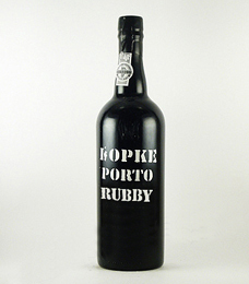
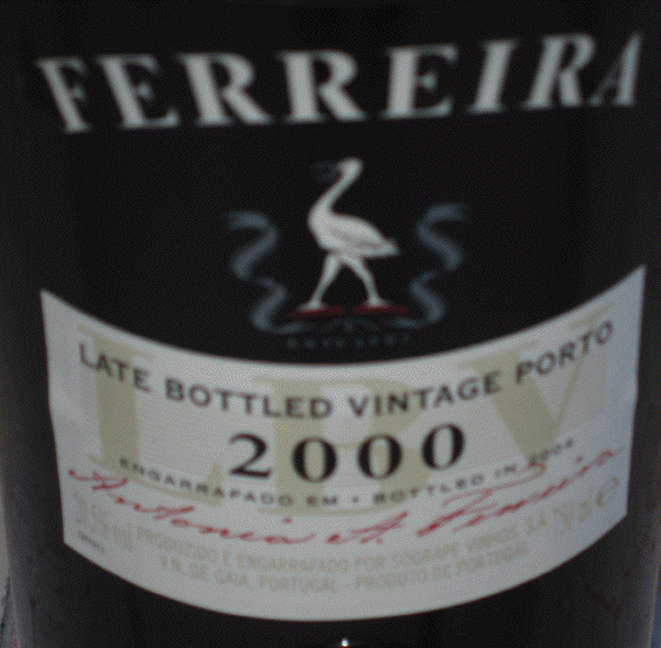
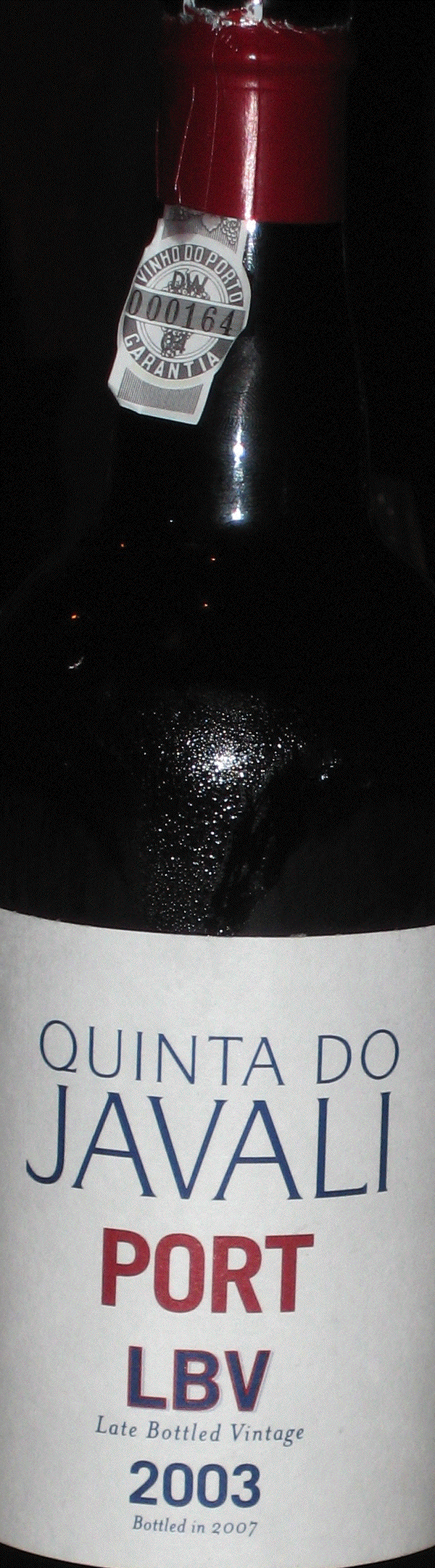
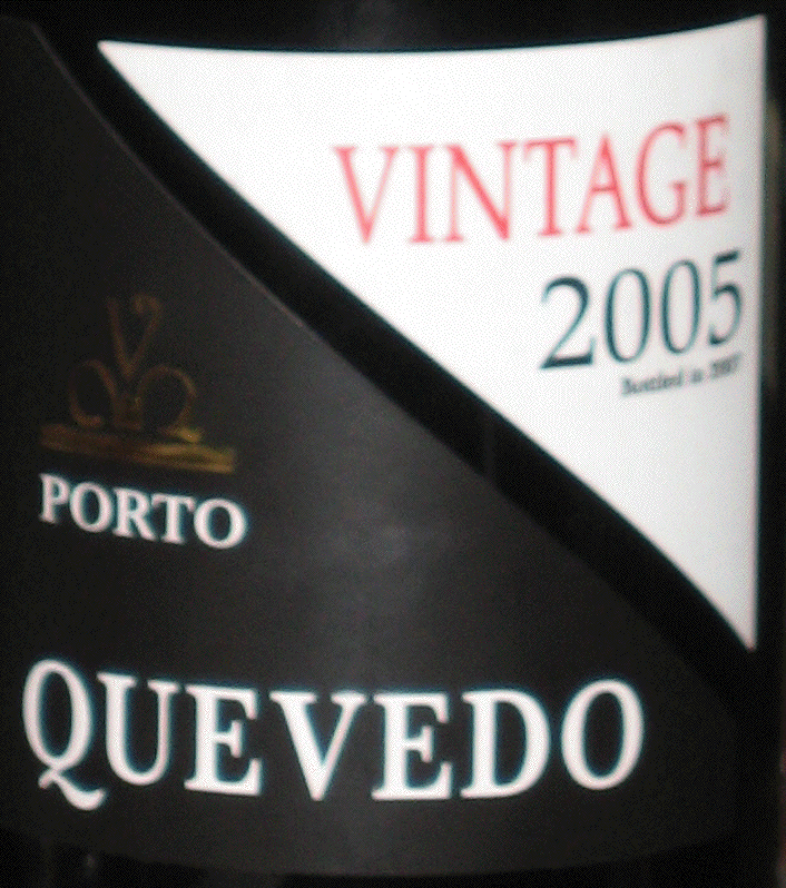
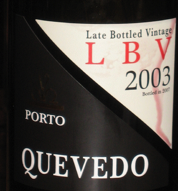
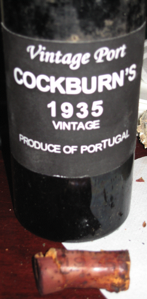
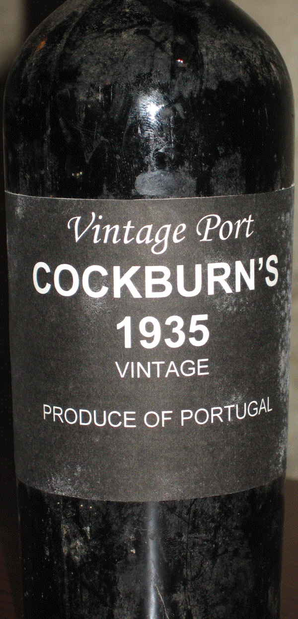
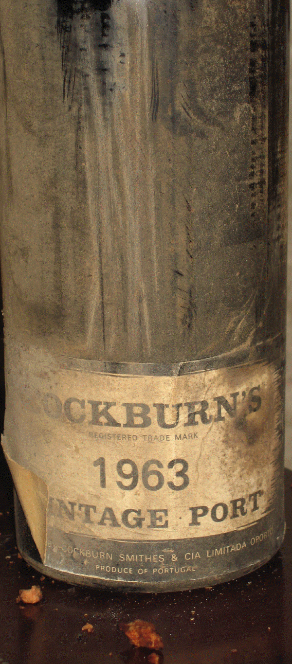
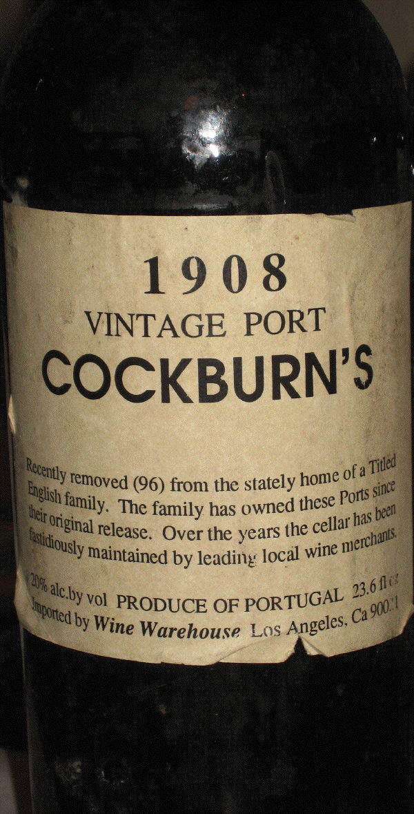
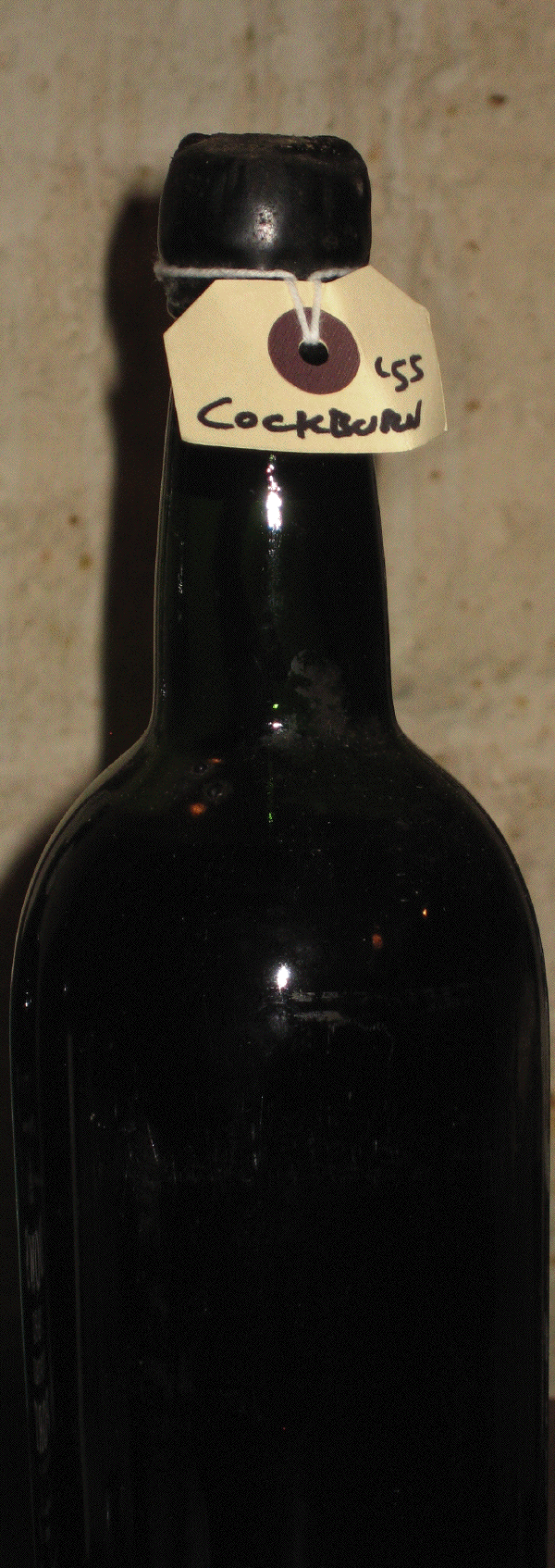
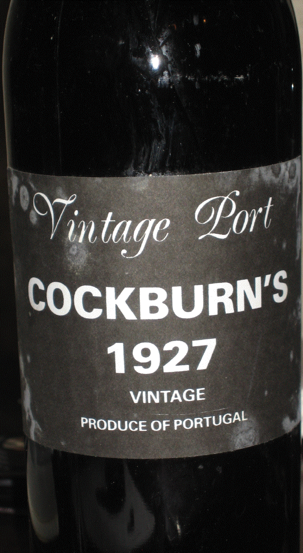
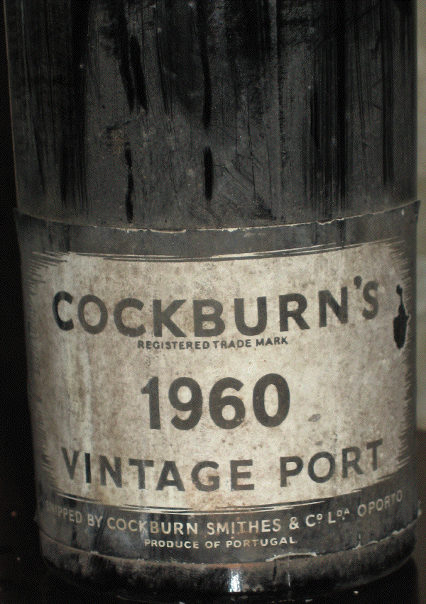
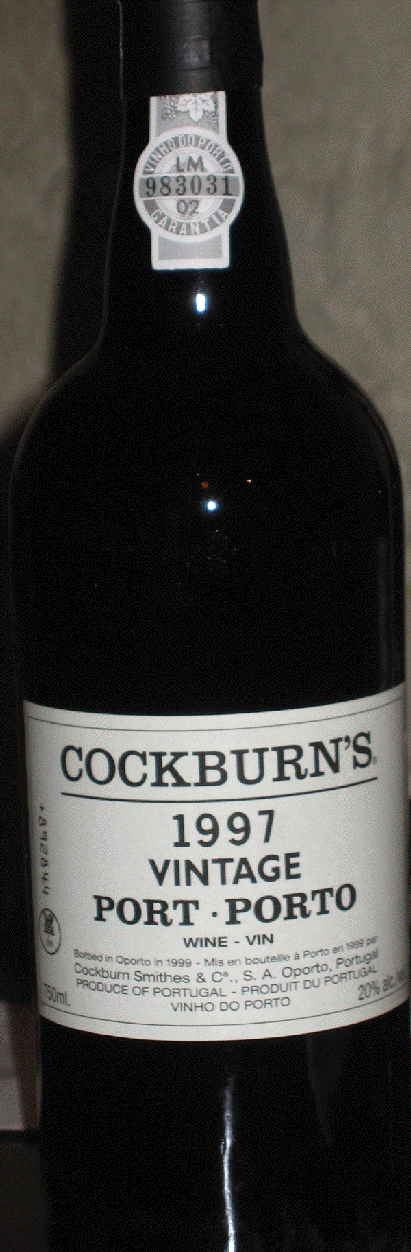
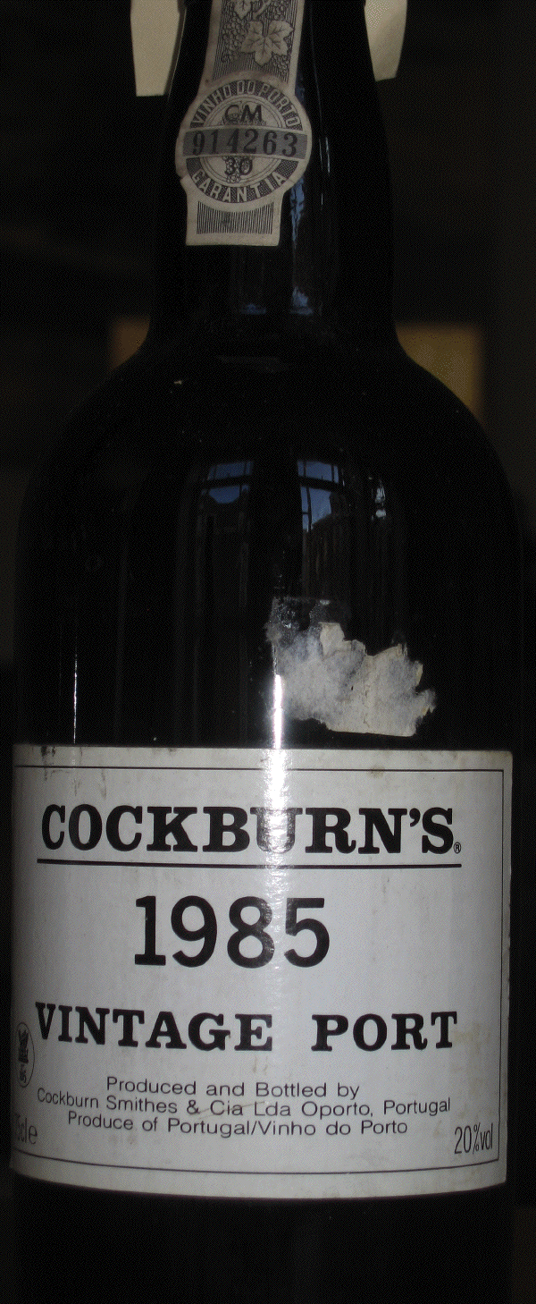
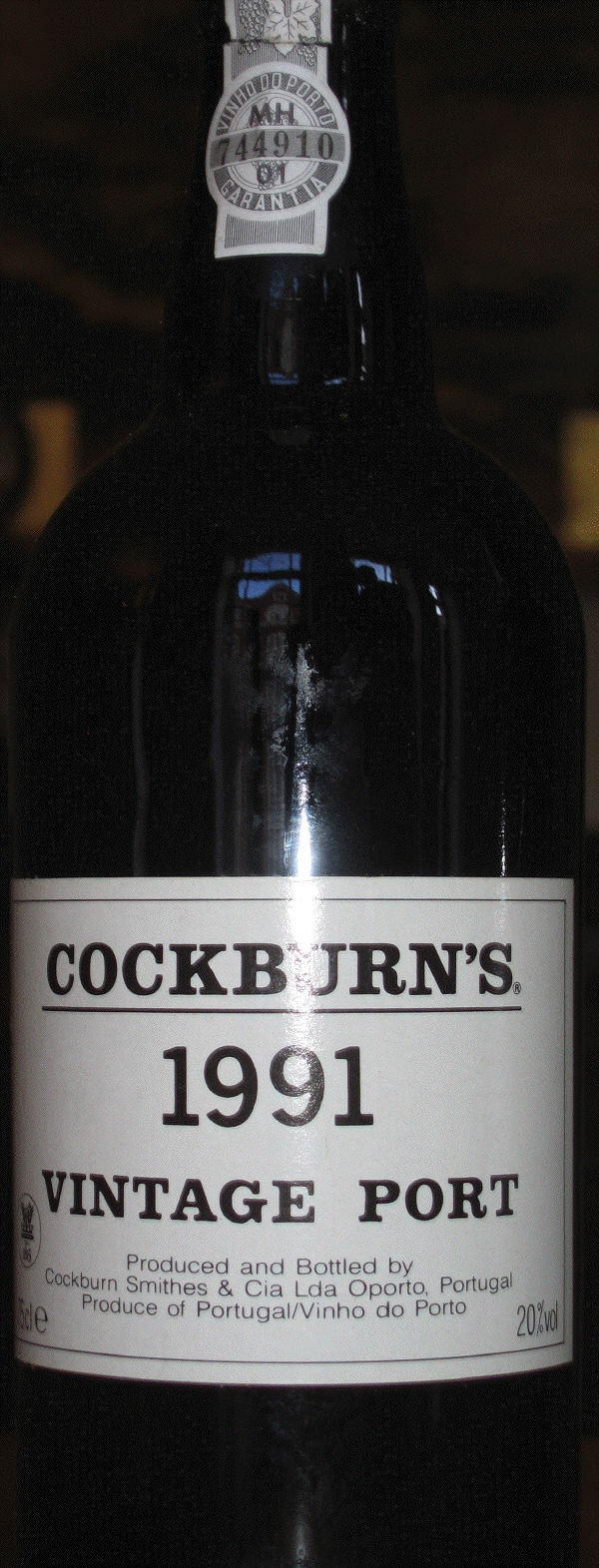
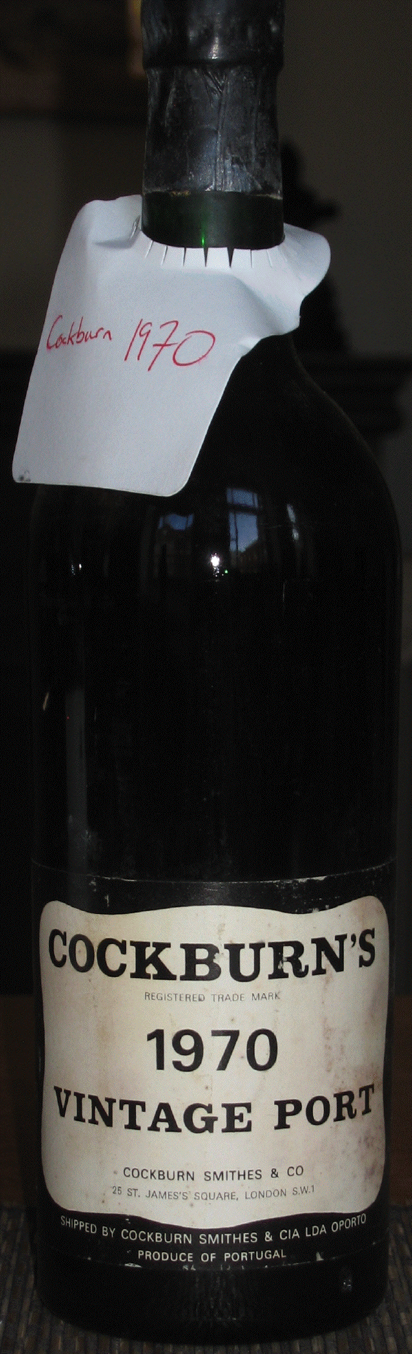
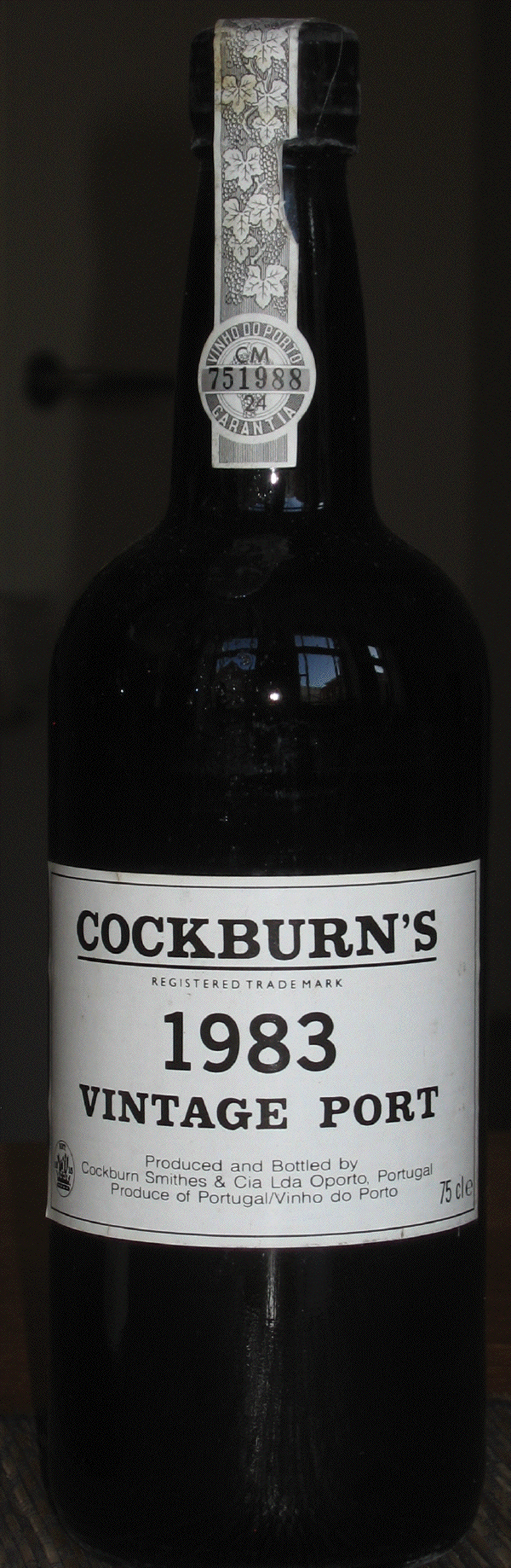
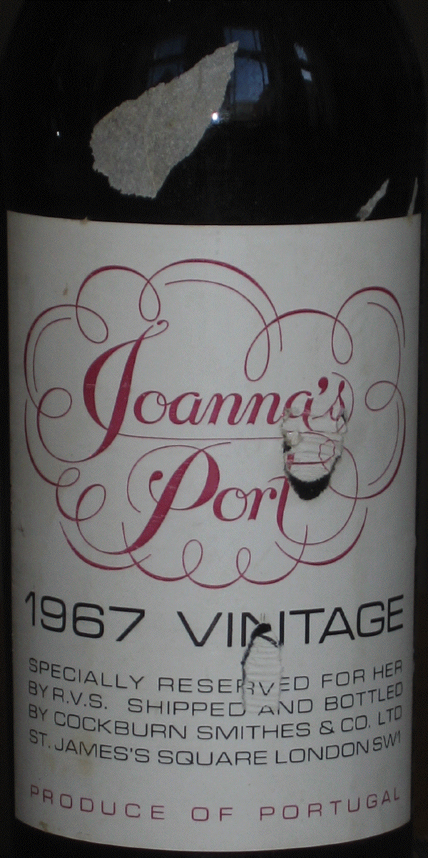
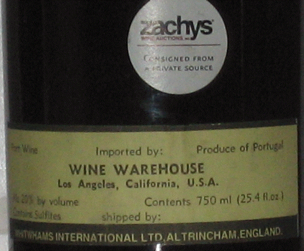
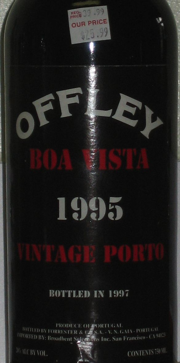
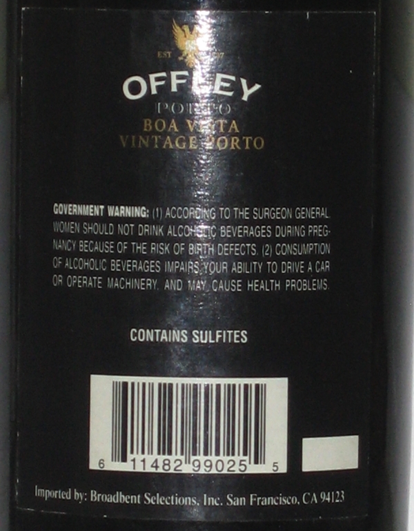
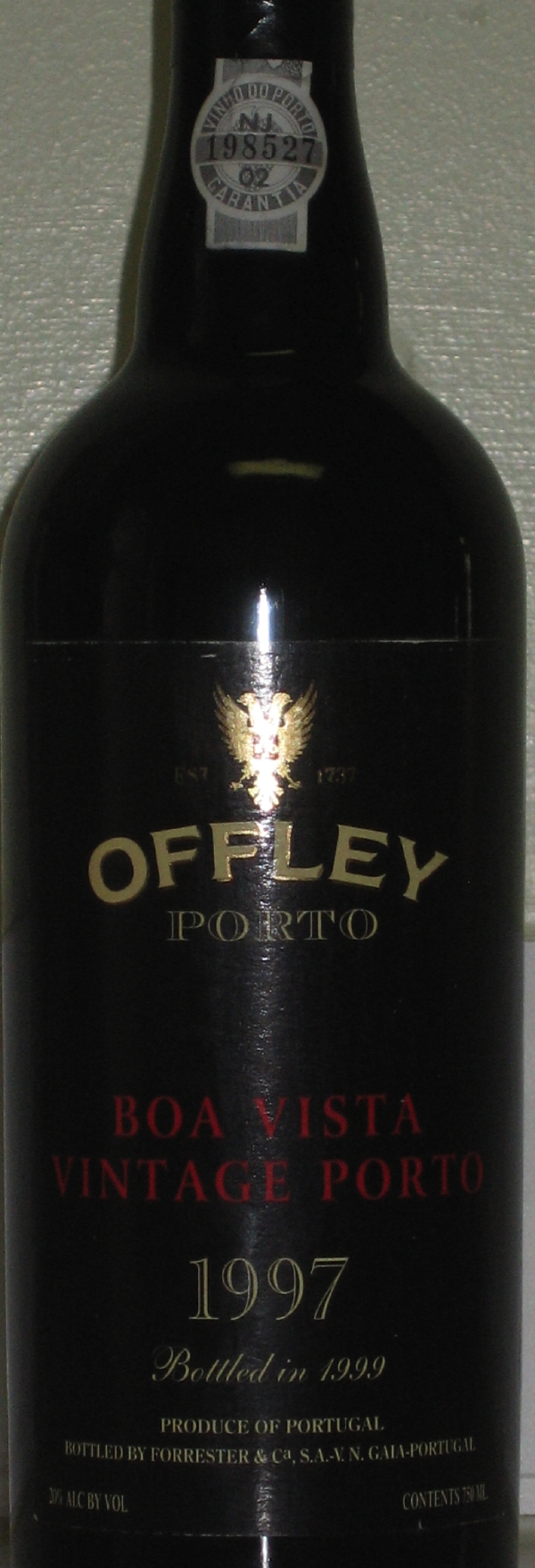
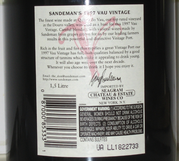
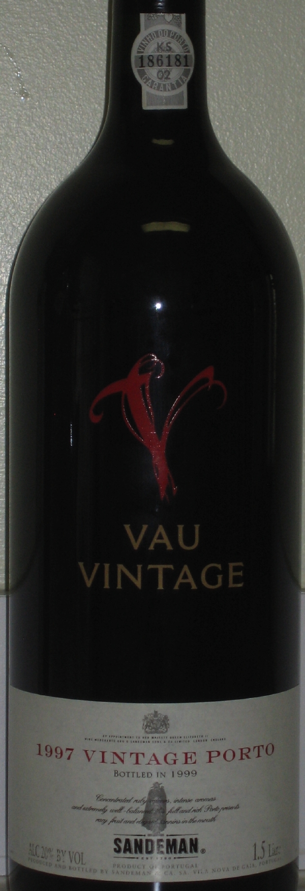
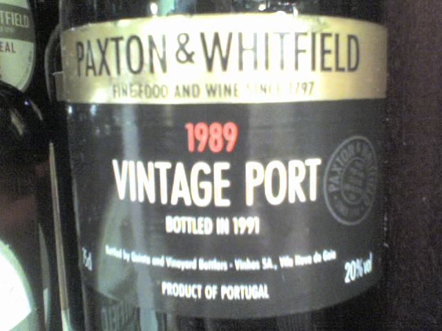
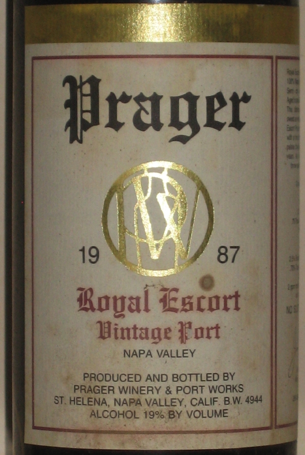
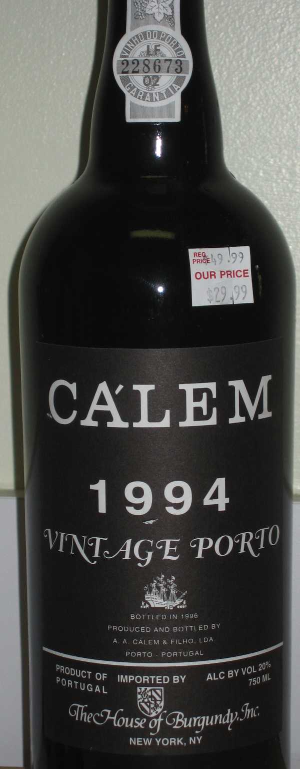
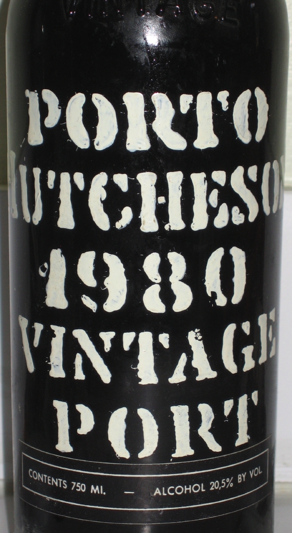
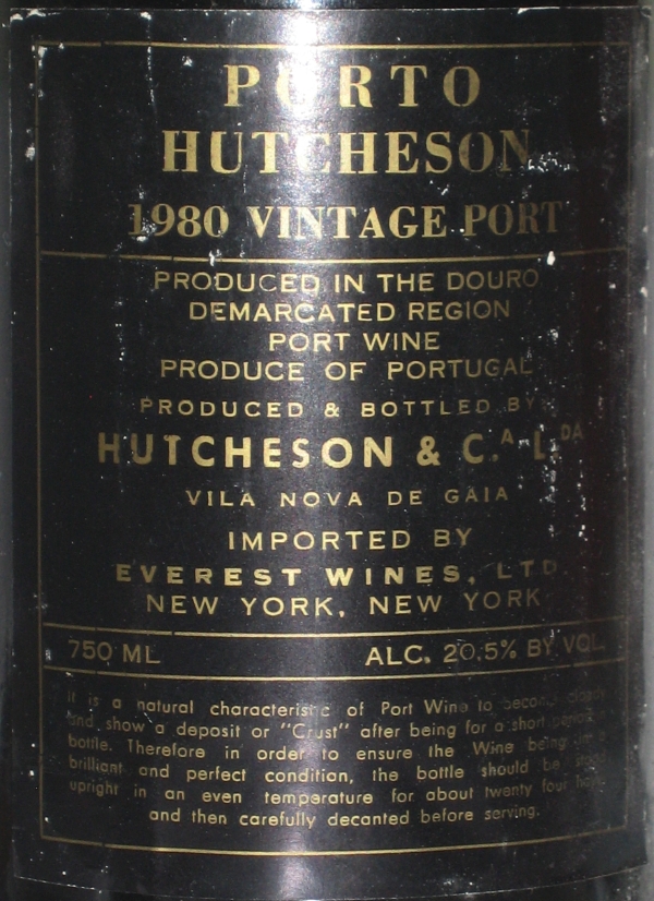
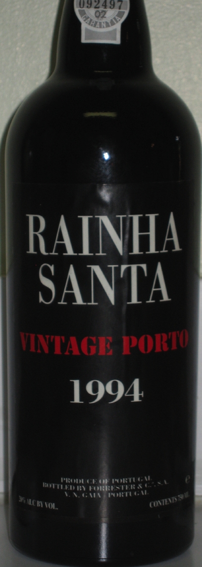
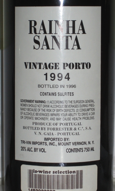
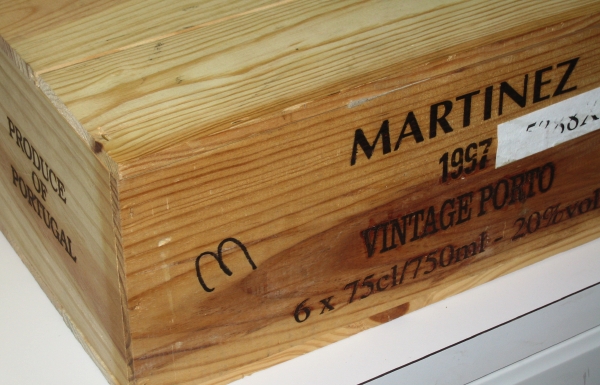
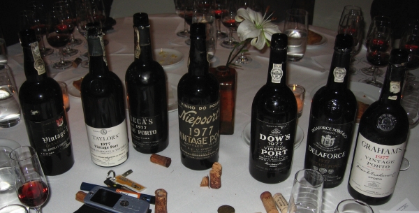
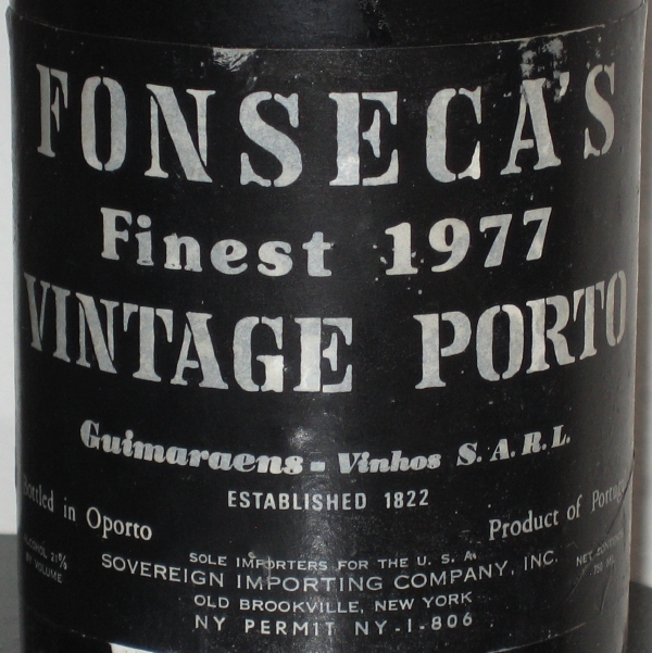
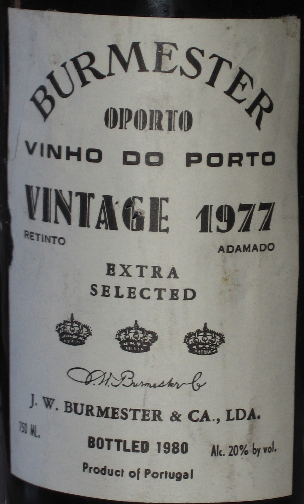
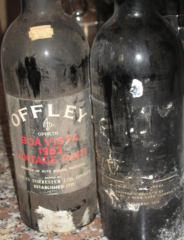
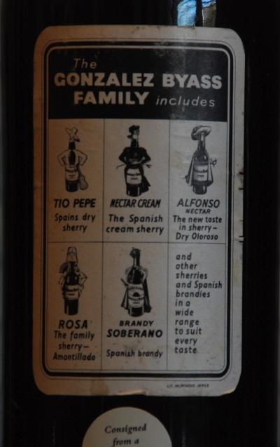
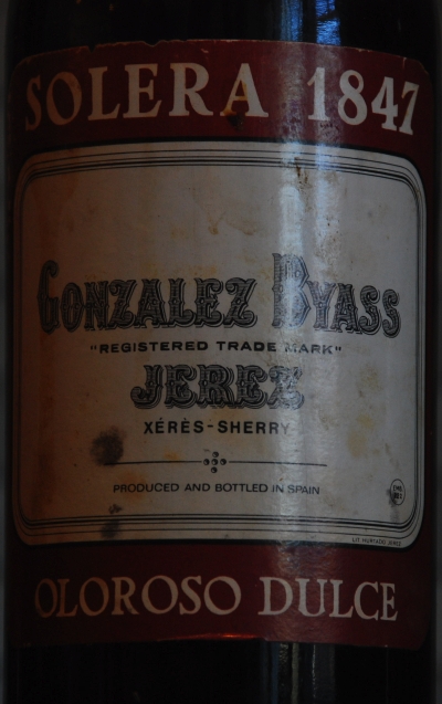
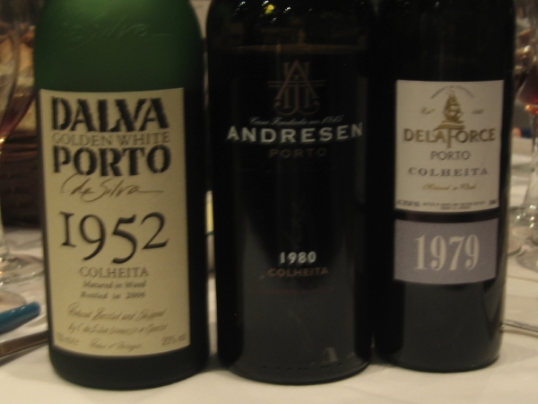
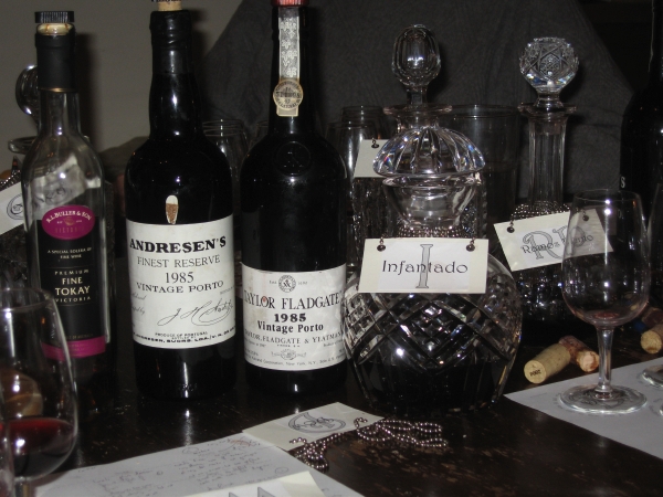
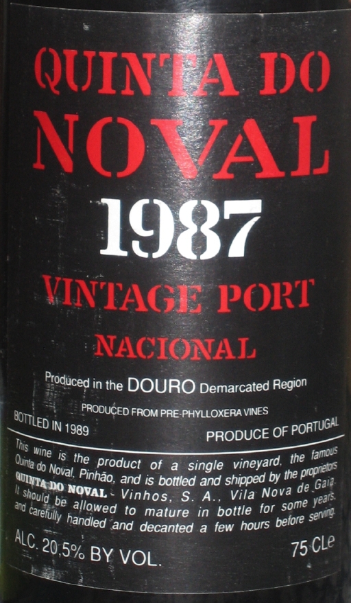
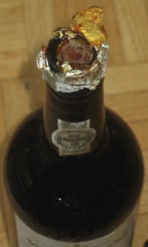
An interest of mine is in typography, which is mostly the design of typefaces (or fonts) and their use in print. I therefore find it quite interesting to have a look at the typefaces and typography of Port labels whenever I open a bottle. Whereas many wines, particularly in the New World, go in for quite complex bottle and label designs, with Port only two things really matter: the name of the shipper and the year, which really brings into pre-eminence the setting of the shipper’s name. Apart, of course, for Sandeman, Port labels are therefore quite text-heavy, which makes the choice of typeface extremely important.
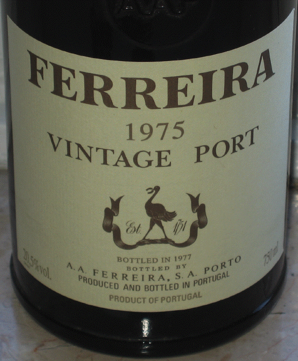
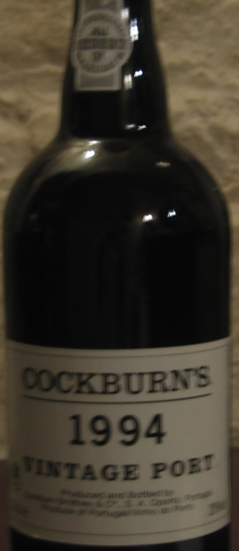
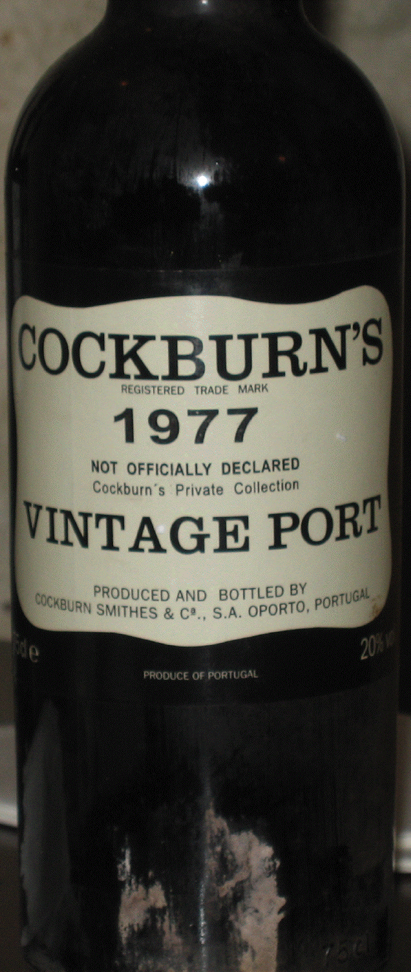
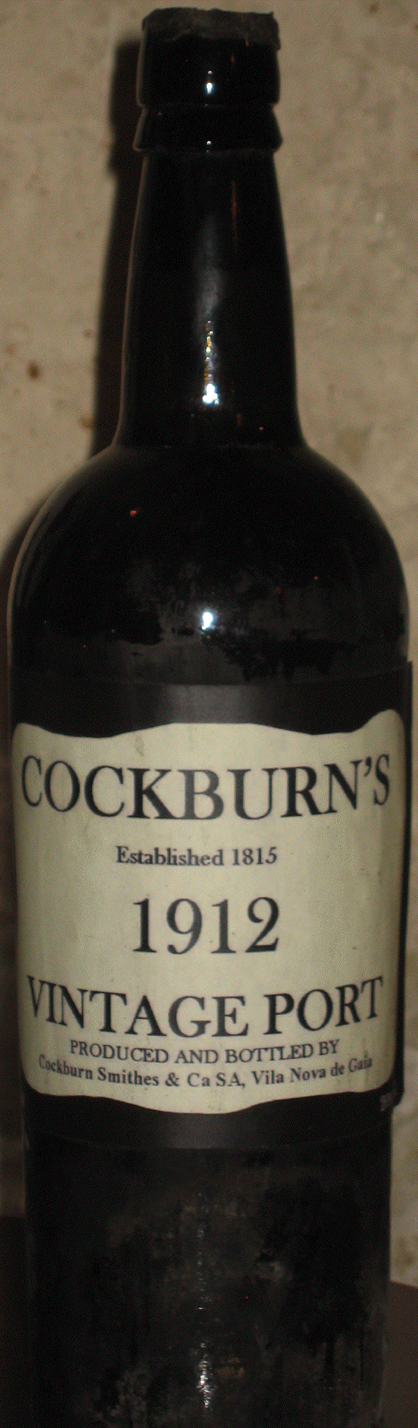
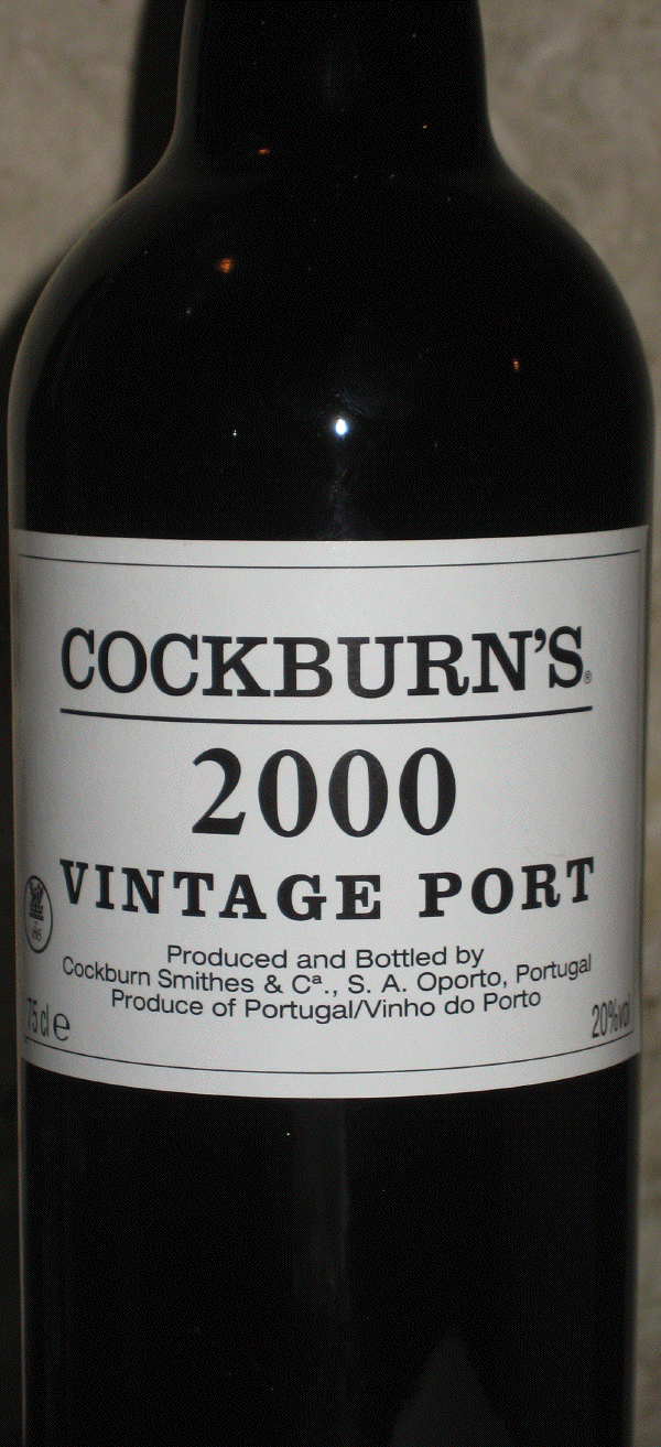
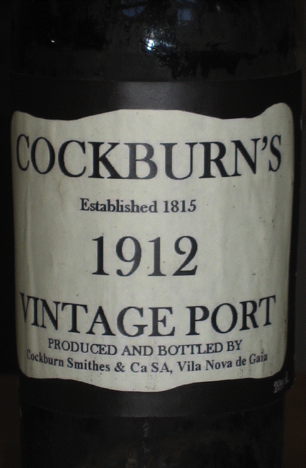
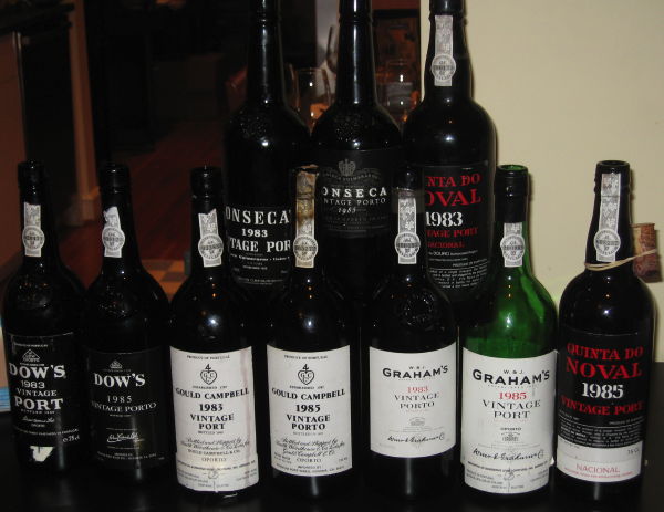
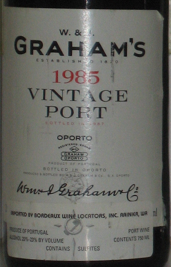
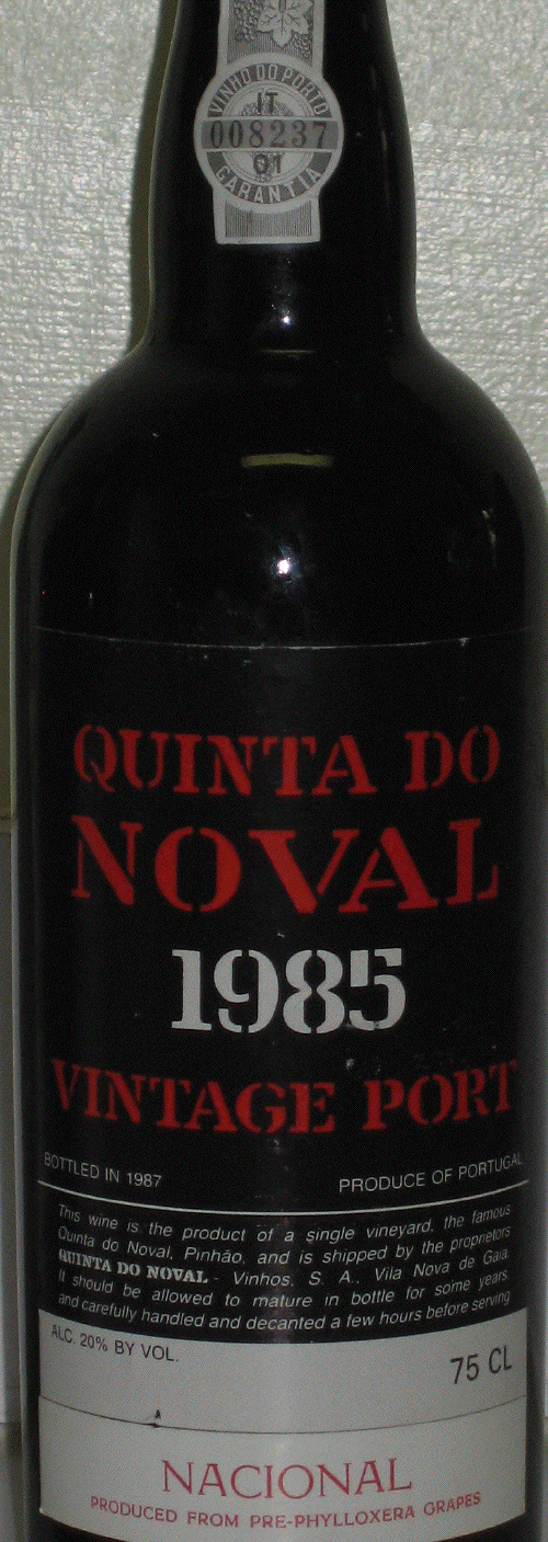
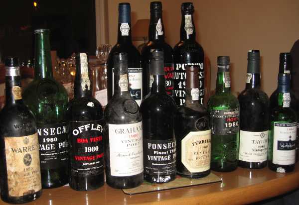
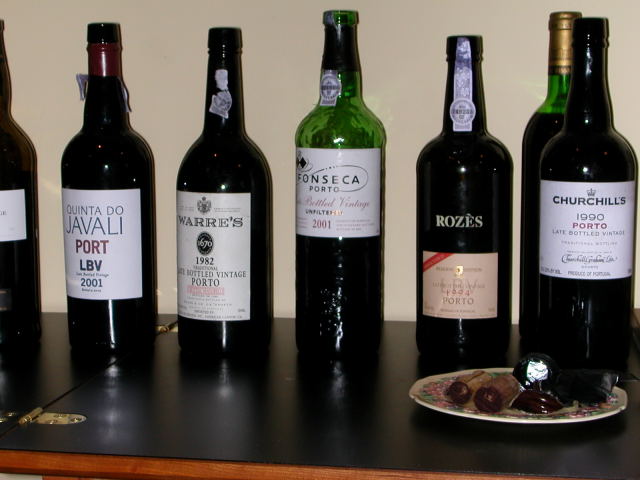
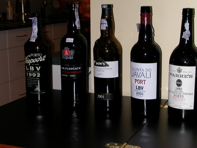
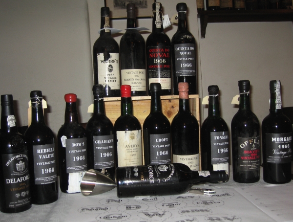
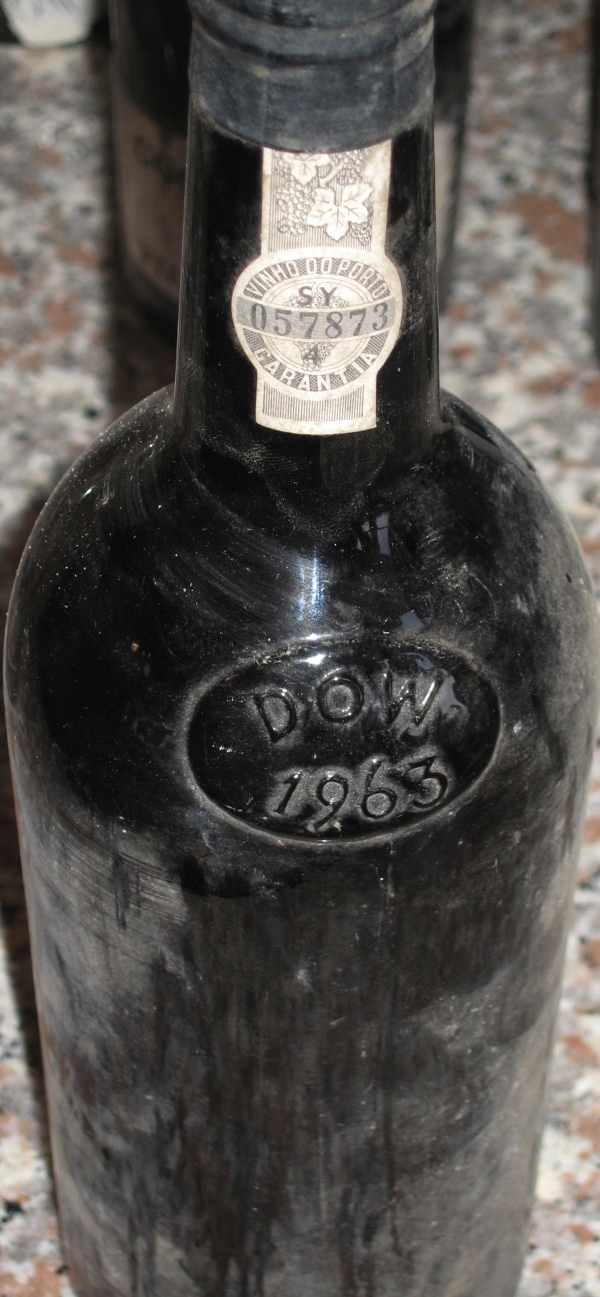
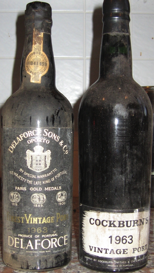
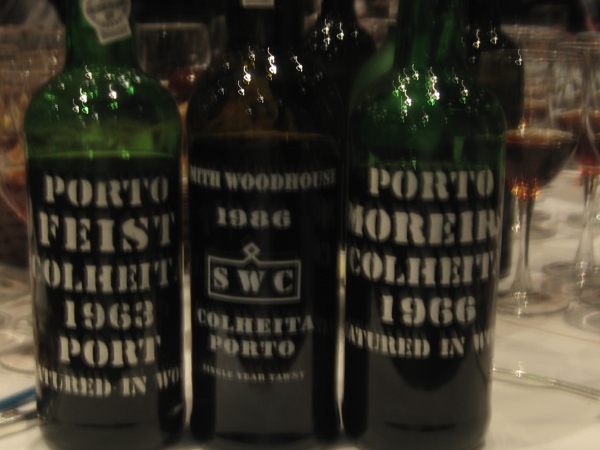
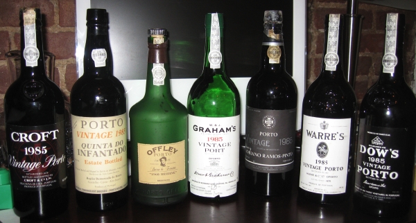
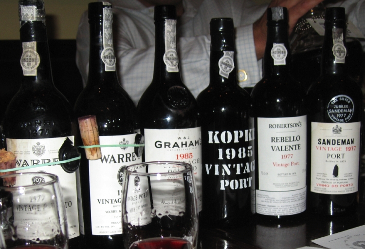
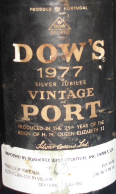
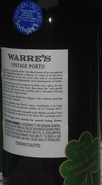
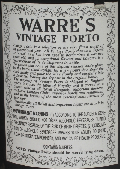
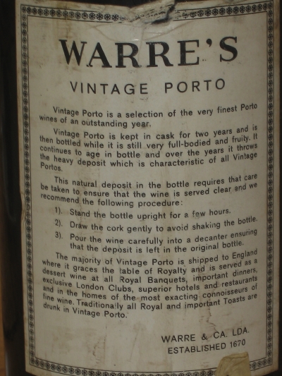
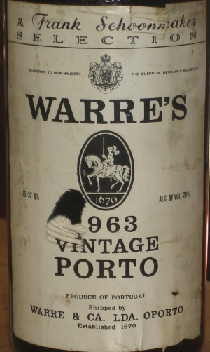
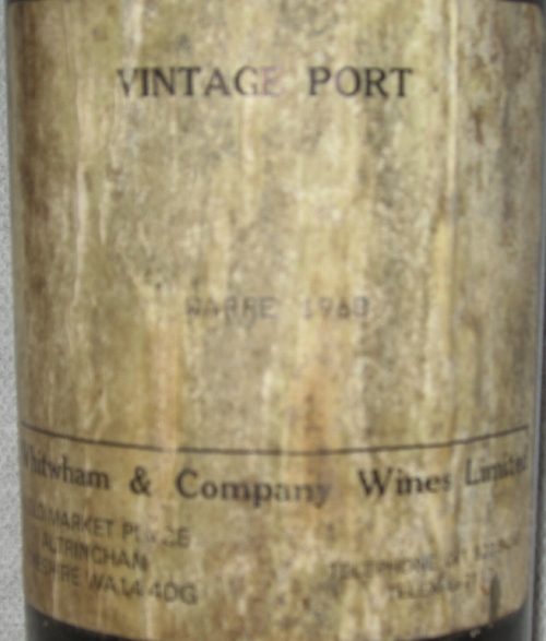
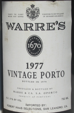
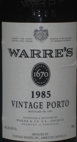
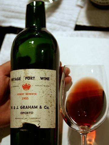
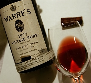
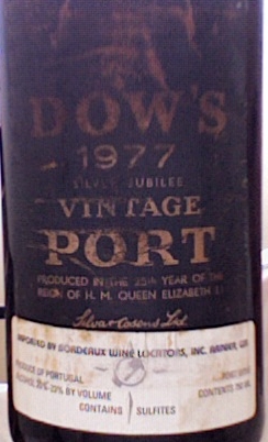
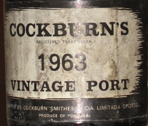
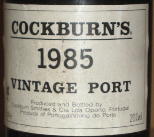
At one end of the spectrum seems to be the Symington brands. They seem to have gone for very solid, very English choices, but with minimum customisation. As far as I can tell, they use Baskerville (Dow), Carlson (Warre) and Gill Sans (Grahams and Gould Campbell) which are perhaps three of the most significant faces to be designed in the UK. Smith Woodhouse looks to me like Copperplate Gothic which is American (Goudy) whilst, interestingly, Quinta do Vesuvio looks like a Modern—something one tends to associate more with Continental Europe than the UK.
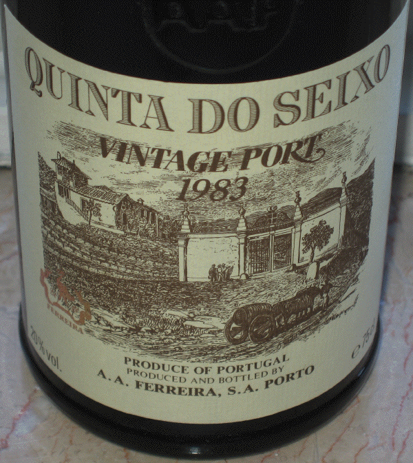
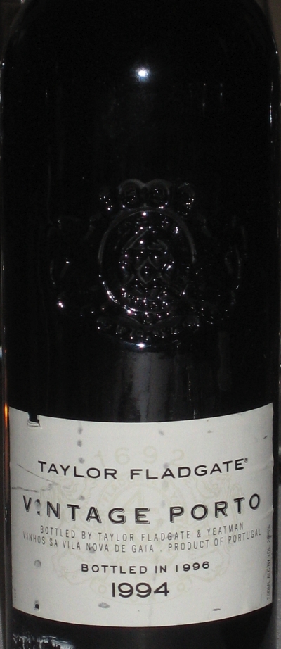
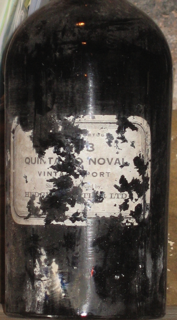
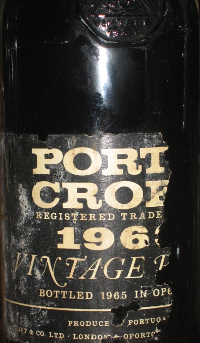
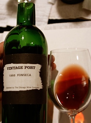
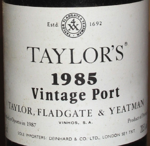
At the other end, we have the Taylor Fladgate Partnership, who appear to have gone for custom faces for all their logos. Taylor’s itself looks like it had some Copperplate Gothic, but is much more flamboyant, particularly in the Y and the R. I think it works, but only just. The worst two logos are Croft, with the diamonds for the beam of the F and in the middle of the O (it really should be on the front of a Hornblower novel) and the TPF logo itself, which I think might have been made out of Papyrus (c.f. “5 Terrible Fonts You Should Never Use in Print†.
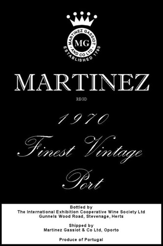
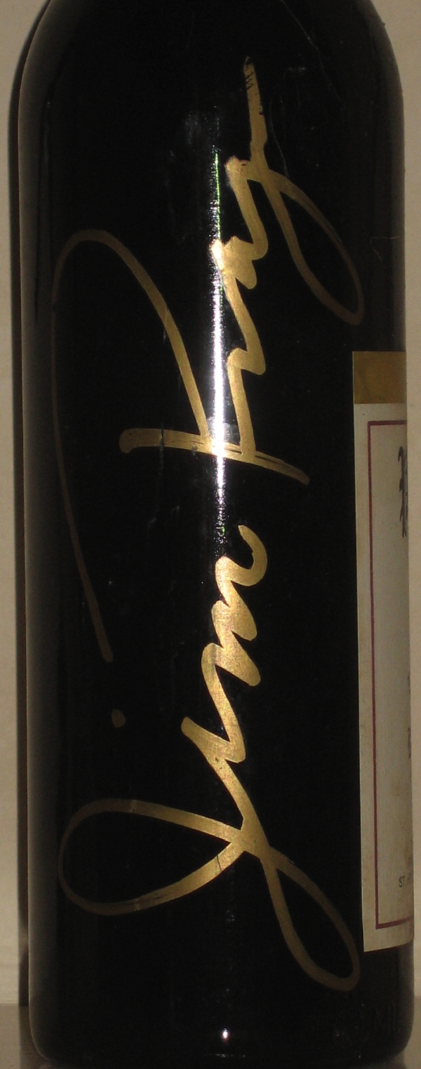
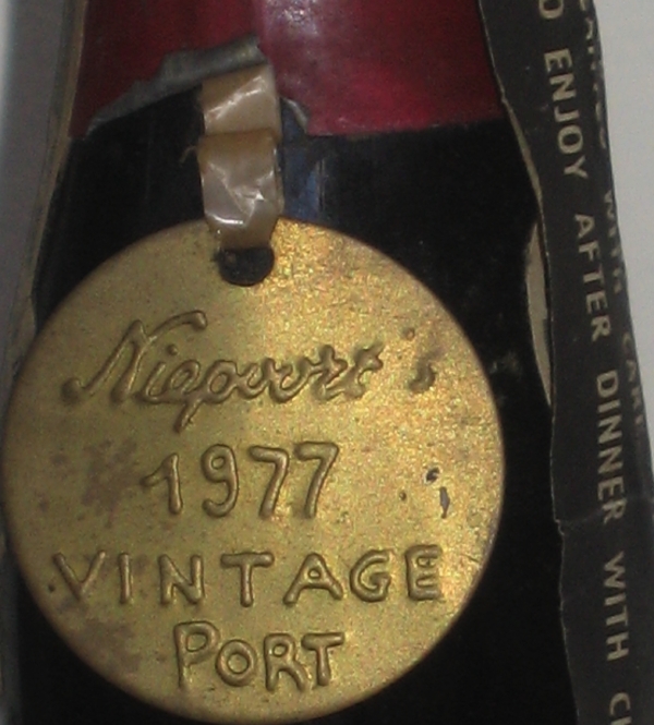
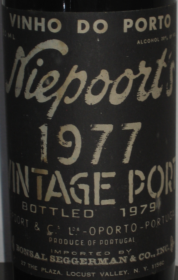
Of course there are other approaches. Niepoort’s hand-written logo looks very cool and others (particularly Sandeman) seem to have gone for quite unusual (possibly even custom) typefaces without drawing attention to its use.
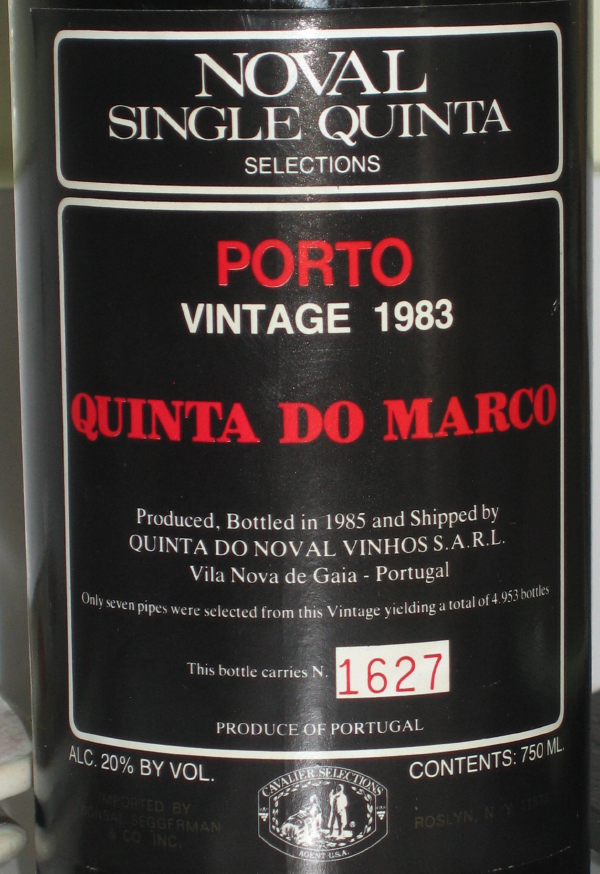
So, do I have any conclusions? Certainly, TFP gets my vote as having the best text-based Port label with its new SQVP ones:
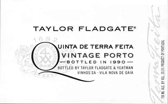
That is typography at it’s best: understated and simple yet immediately memorable. Equally, perhaps they could have achieved the same result with a little less effort and money by adopting the Symington’s approach and wouldn’t have commissioned such poor work as the TFP logo.
Just some thoughts… What choice of typefaces do you particularly admire on Port?


