I organise a number of introductory port tastings, for groups of various levels of prior knowledge. Usually these tastings include wines of various styles - typically a white, some Tawnies With Indication of Age (TWIOA), a good LBV and a couple of vintage ports.
I always make placemats for these events, but increasingly I find that I am unhappy with the results. Why? Because the titles (and variants and derivatives thereof) in the circle for each glass are inevitably trying to convey all kinds of different information, which is not standard from glass to glass. I'll illustrate this with an example from a forthcoming tasting.
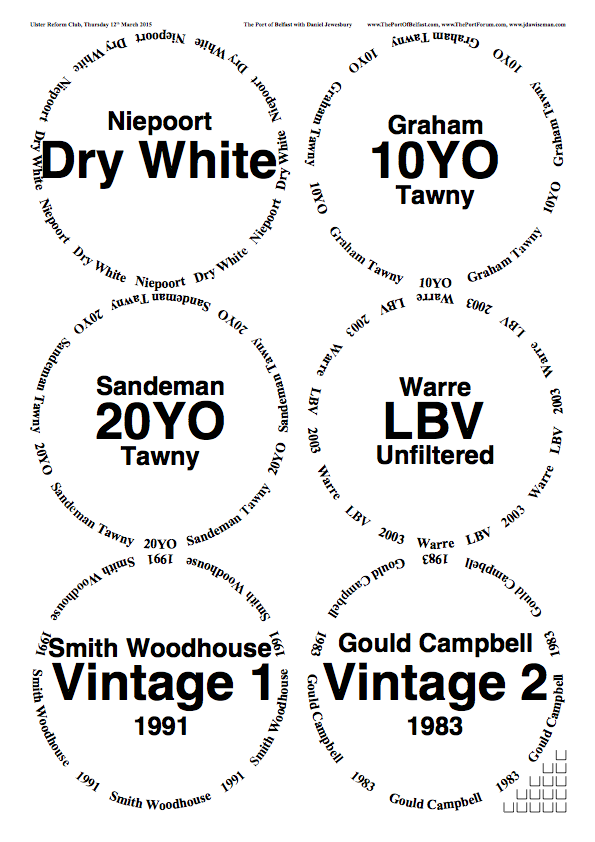
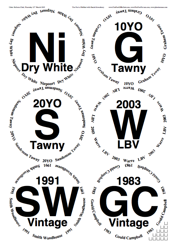
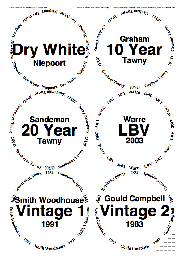
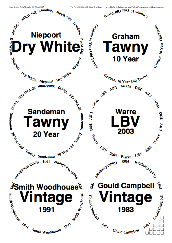
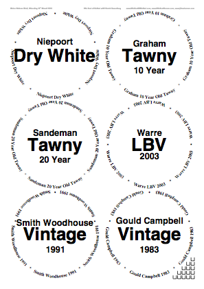
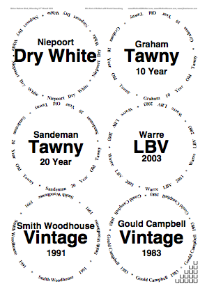
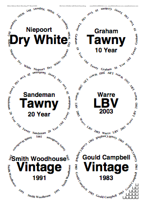
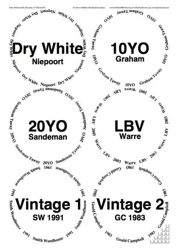
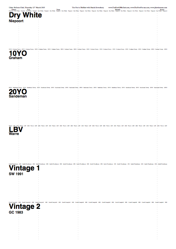
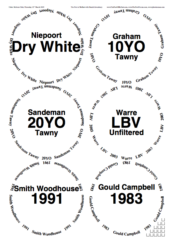
The line-up for the tasting is as follows:
- Niepoort Dry White
- Graham 10YO Tawny
- Sandeman 20YO Tawny
- Warre Unfiltered LBV 2003
- Smith Woodhouse 1991 VP
- Gould Campbell 1983 VP
The wines are of four different categories, and the description of each category requires particular information. This is not standard; in some cases the shipper name is more important, in others the designation of age, or the style. On the other hand, when we make placemats, we like to use the various levels of Title information - Titles, Abovetitles, Belowtitles, and Overtitles - for the same class of information in each circle. This is impossible when the classes of information are not uniform.
Below are three examples of sample placemats which are all ugly to my eye, and which I cannot see a simple way to standardise that is both aesthetically pleasing, and informationally efficient. In the first example, there is a certain level of uniformity, but it feels ugly overall and the bottom two circles feel a bit messy. In the second example, the information is a little more standardised but the whole thing is unbalanced and ugly. The final example is a different variant of the same problem.
Placemat makers: I have not used Overtitles in any example simply because there is no single standard piece of information, apart from shipper names, that is common across all categories. I want to avoid using shipper abbreviations (as used in the first example) as these are not meaningful outside of this padded cell; but 'Smith Woodhouse' is so much longer a string than 'Warre' that it is impractical to use these as Overtitles.
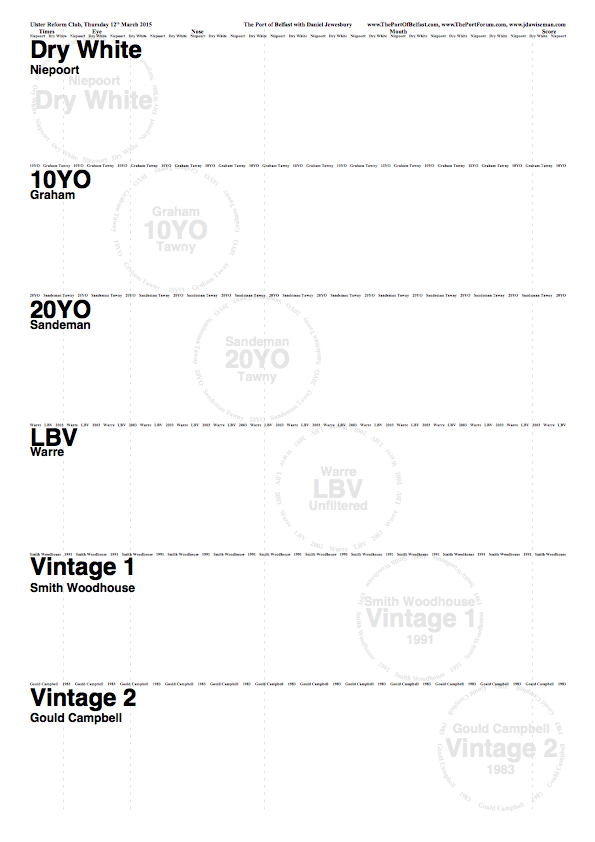
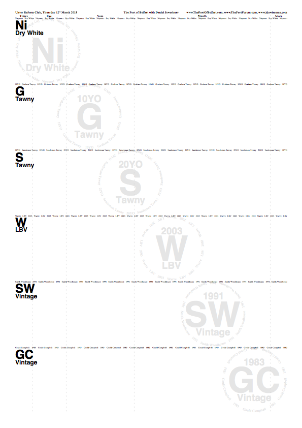
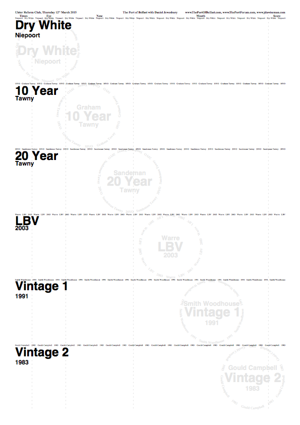
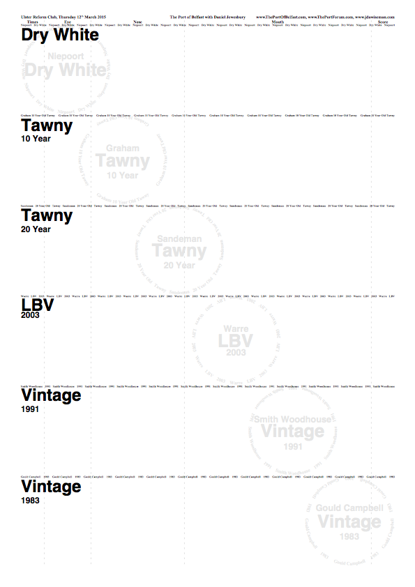
Here are the examples, please post your thoughts. Going on past form, I expect to disagree with everything everyone says, but hopefully that will enable me to have a better idea of mine own. I include the TN pages as these give you an idea of how the different uses of Title elements feed through to the information displayed on those pages. Note: these PNGs do not link to larger images or PDFs.
Example One
Example Two
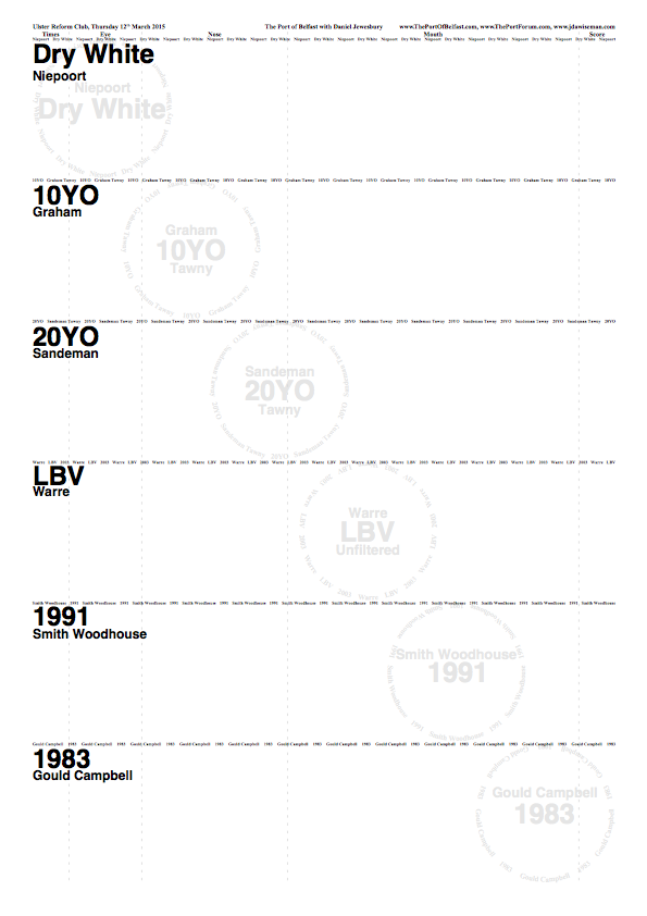
Example Three